Deal-Breakers and Dead-Ends: Six Turn-Offs That Alienate Website Visitors
February 2014
By Jeremy Girard
Without question, the task of driving new visitors to your company’s website is not easy. Success requires serious strategic planning and a significant investment of resources, from content marketing and social media promotion to search engine advertising and offline marketing initiatives.
So once those hard-won visitors arrive, why in the world would you immediately turn them away? Well, you certainly wouldn’t do so intentionally, but there may be deal-breakers and dead-ends lurking within your site that will repel a potential new customer faster than a cheesy pick-up line and cheap cologne.
Here are six mood-killers that you must avoid if you hope to woo new customers, entice them to engage with your site and provide such a positive experience that they will tell all their friends what a great catch you are:
1. Download our app
If you’ve invested in creating an app for your brand, naturally you want to bring this to the attention of mobile visitors and encourage them to download it. But it’s all too easy to cross the line between promoting your app and perturbing your customer.
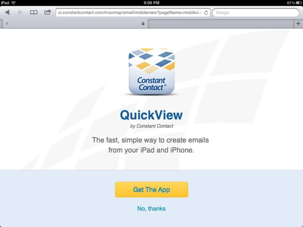
Recently, I was in the process of working on an email marketing campaign using the popular service Constant Contact. I found myself with a spare moment between meetings, so I grabbed my iPad and set out to make a few quick edits to my draft. When I logged into the site and selected the email I wanted to edit, I was greeted with a message asking me if I wanted to download “QuickView”, their app for iPad and iPhone.

But I was in a rush and had no interest in downloading and figuring out how to use their app to accomplish the simple task of making changes to an email I had already begun crafting. So I clicked “No, thanks” and was then returned to my list of emails. Once again, I clicked the email that I wanted to edit – and once again I was greeted with the prompt to download the app. I was stuck in a loop of non-productivity. Unless I installed the app, I could not complete my desired action on my iPad. By any standard, this was a very poor user experience.
Unfortunately, this is not an unusual scenario. If you browse the Web on your mobile device with regularity, you’ve undoubtedly encountered this type of “Download our app!” a number of times. However, the problem arises when downloading an app is the only viable way to interface with a site via a mobile device and the objective of providing a good user experience is sacrificed in the interest of securing a permanent spot in the user’s pocket.
Instead of trying to force your app on mobile visitors, take a more subtle approach. For example, displaying a small banner at the top of your site’s mobile view is a great way to make users aware of your app without disrupting their workflow or compromising the quality of their experience. Never, ever require your visitors to download an app to use your site; rather show them the respect of allowing them to interact with your brand in the way that they most prefer, whether that’s through a browser or through your app.
2. Give us your digits
We get it. When a new visitor comes to your website, you want to capture as much information about them as quickly as possible so that you can continue your engagement with them long after they’ve moved on to other corners of the Web.
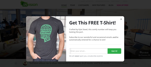
With this motivation in mind, there are many sites that immediately greet new visitors with a pop-up-style message. Instead of seeing the expected home page content, the user is presented with a request to complete a form to provide their contact information in exchange for a welcome discount offer or to follow the company on Facebook for future updates and promotions. Either way, these pop-ups are very disruptive to the user experience and provide obstacles that only make it more difficult for the visitor to accomplish what they originally came to the site to do.

Think about this experience for a moment. Yes, it would be ideal if every visitor to your site would willingly complete a short form that gives you invaluable data. But in reality, no one comes to your site for the express purpose of helping you market to them, so by giving such a message top priority, you are telling them that your needs are more important than theirs. That’s a pretty poor way to start the conversation.
This phenomenon is so pervasive that there is even an entire website –
tabcloseddidntread.com – dedicated to these types of interruptive messages. While the writing on the site is a bit snarky, the point it makes is a valid one: these messages create a poor user experience from the outset. As a result, any value you might gain in collecting user data is quickly negated if that user has no interest in continuing their engagement with you because you’ve created such a negative first encounter.
Instead of leading off the conversation with your survey request, Facebook follow prompt or current promotion, simply allow your visitors to dive right into the site to find the information they’re seeking or complete their desired task. Keep your mailing list sign-up and Facebook links in your site’s universal framework, and if you do your job in creating a positive experience for them, your visitors will willingly allow you to become a presence in their email inbox or their Facebook news feed all on their own.
3. One-size-fits-all framework
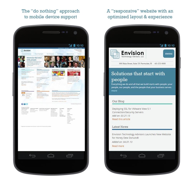
Today’s website visitors are accessing our sites on a wide ranging variety of devices with a myriad of different screen sizes, and yet, many sites are still built with the “desktop-only” mindset of years ago. This is a major strike for users on mobile devices who expect more from their experience than simply seeing the desktop site shrunk down to display on their small screen, with text that’s illegibly tiny and links that are nearly impossible to press. The Web is no longer a one-size-fits-all world.
That being said, while one “size” may not fit all, you can still have one site that will work seamlessly on a wide variety of screen sizes and devices. By employing responsive design, you can build a singular jack-of-all-trades workhorse that dynamically reflows its layout based on the user’s screen size.
The image below illustrates the difference between how desktop-only layout (i.e., the “do nothing” approach) is rendered on a phone’s browser versus a site that’s optimized for small screens with a responsive approach.
 Read more: Website Design for a Multi-Device World
4. Vexing video
Video can be a powerful way to convey information, but if that video fails, then your message is lost.
There are a few ways that video can provide a stumbling block to engagement with your site visitors. First and foremost, not all video formats are compatible with all devices. For instance, Flash videos will not play on iPhones and iPads, which means that instead of seeing your excellent video content, every user on an iOS device will get a message that says something to the effect of “This video cannot be shown on your device.”
Other visitors may not want to download a large video due to limited bandwidth or data download concerns, and as a result, your content is not able to achieve the effect you desire.
In still other cases, your visitors may be able to download and view a video but may not be able to use audio – perhaps because they are in a public area, such as an office or store. Video without audio is fairly anti-climactic, so if the only way they can consume your message is by watching and listening, then you will leave these visitors cold.
The moral of the story is this: If you are going to use embedded video on your site, make sure to choose a format that can be played on all devices and to reinforce its key message and content in other areas for visitors who may not want to watch or listen to a video.
5. The mystery of the disappearing navigation
Your website’s navigation structure is a critical component of the user experience, and the links it contains are the gateway to the information your visitors are seeking.
For sites with lots of pages and a deep sitemap, a common design schema is to use drop-down menus that show subpages contained underneath the site’s top-level navigation choices. These drop-down menus are typically powered by Javascript.
But what happens if the user has disabled Javascript in their browser or if that script fails to load for some reason? When this happens, your navigation menus may never be shown, leaving visitors stranded with no way to easily maneuver through your site.
Failure to load a script is not the only way that navigation suddenly goes missing. Some sites with very elaborate navigation options for the desktop version eliminate the bulk of those options for mobile devices. This can create a dead-end for users who are familiar with the desktop version and are left searching aimlessly for links they will never find.
Instead of eliminating links for smaller screens, find ways to present the same content in a way that’s better suited to the device’s display. Additionally, make sure that your site’s navigation has a fallback option should a script fail to load or something else unexpected happens.
6. Page is loading…
Today’s websites have become fat, bloated behemoths. Oversized images and animations, embedded videos and other features have contributed to the substantial size increases we have seen in webpages over the past few years. Bigger pages mean longer load times, which is a major turn-off for visitors who have no lack of other suitors vying for their time and attention online.
Better website performance will yield better website results. By optimizing your site’s performance and ensuring that it loads quickly even for visitors with slower connection speeds, you can avoid showing users a half-loaded page and hoping that they will wait around to see the rest. More often than not, that’s a losing gamble, and the visitor you worked so hard to win will turn elsewhere to find a site that will perform according to their expectations.
Jeremy Girard has been designing for the web since 1999. He is currently employed at the Providence, Rhode Island-based firm Envision Technology Advisors and also teaches website design and front-end development at the University of Rhode Island. In addition, Jeremy contributes regularly to a number of websites and magazines focused on business and the Web, including his personal site at Pumpkin-King.com.