Four Fears That Sink a Website
March 2011
By The Craftsman

Your website is one of the most important tools in your business growth arsenal. However, website development is a complex science, and there are any number of opportunities for the process to go awry.
Following are four common decision points where uncertainty or indecision can compromise the execution of good design, content and functionality, resulting in a site that doesn’t perform.
Not catering to every possible customer and every imaginable need
You never want to waste the opportunity to gain a new customer. When you think about all the people sitting in front of a keyboard who could potentially land on your site, it’s difficult not to want to swing for the fences.
However, the penalty for trying to appeal to everyone is that you’ll appeal to no one. You’ll end up with bland, unfocused content that speaks in broad generalities rather than razor-sharp sales copy that addresses key points.
It’s critical to think about the type of person who falls within your core target audience, how they most likely arrived at your site, what their level of familiarity with your product or service is, and what is required to convince them to take the next step – whether that’s submitting a contact form, picking up the phone or making a purchase.
When you’re honest and realistic about who you’re really speaking to, you can build your site around powerful sales messages that hit home and compel action rather than settling for an insipid and ineffectual approach that fails to motivate anyone to do anything.

Not addressing every question on the home page
This is the corollary to the fear of not serving every possible visitor.
You’re afraid that if every potential question that someone could have is not addressed as soon as they land on your home page, you’ll lose them. The result is a cluttered mess, and the reality is that you’ll turn away more customers than you’ll win because no one will be able to find what they’re looking for.
It’s important to divide your website visitors into audience segments based on their needs and motivations and provide funnels for each user type that point them to the tools and information contained below the surface of your site that are most relevant to them.
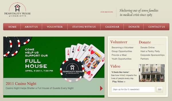
For example, if you’re a non-profit, chances are that you have three primary audience segments: prospective clients, prospective donors and prospective volunteers. The only two jobs your home page must accomplish are conveying your mission, so that all of these groups understand who you are and what you do, and providing clear signposts that guide each segment to content within your site that is tailored to their specific needs.

Website users are in no way averse to clicking and navigating; they just need your help in knowing where to go.
Not providing enough information to close the sale
Unlike when you’re face-to-face with a prospective customer, when someone is browsing your website, you don’t have the ability to adjust and tailor your sales pitch on the fly based on the flow of conversation.
As a result, the tendency is to include any and every detail possible within the copy on your website in order to make sure you address all possible questions and sales objections. After all, if someone can’t find what they’re looking for on your site, they’ll give up and you’ll never hear from them again, right?
Wrong. When you provide too much information, it makes it difficult for users to find anything of real use or value to them.
In the
culture of the Web where time and attention spans are severely limited, “less is more” is a universal truth – as long as that “less” is well-chosen and well-crafted. You simply can’t afford to put every detail about your product, service, company or brand on your site. Instead, you must make smart choices and be strategic in the way you present information on your website so that you capture visitors’ interest provide the best possible user experience.
By stripping down your content to only that which is most relevant and most useful to your target audience, you’ll make the good stuff more prominent and make it easier for users to find exactly what they’re looking for.
Brief, powerful, well-organized copy will win out every time over page after page of verbose, indirect, indecipherable content.
Read more:
Ten Secrets of Must-Read Copy
Not doing everything the competition is doing
It is the curse of anyone charged with the task of growing a business to obsess over the competition. The Web only intensifies this fixation because everything is highly visible.
It’s tempting to make sure that your website does everything in exactly the same way as your competitor’s because it’s right there in front of you.
Or is it?
You don’t know the motivations – business growth driven or otherwise – that determined why they chose to go one route over another. You also aren’t likely to know if they have a great web architect directing them or if they’re just grasping at straws and trying to capitalize on every web design trend
du jour.
If their site features bells and whistles that yours doesn’t, that doesn’t necessarily put you at a disadvantage. For example, you might envy the colorful, eye-catching animation on your competitor’s website. But what you may not realize is that those effects were created in Flash and are therefore invisible to anyone who might be trying to access their site on an iPhone or iPad.
Moreover, you may be competing for some of the same customers, but that doesn’t mean that your business models are the same. Their strengths are not your strengths, and your long-term growth plans may be leading your company in a different direction.
You need to ensure that your site serves your business growth objectives – present and future – not theirs. Let them do what they want. If you stay true to your own goals and your own well-founded knowledge of your customers, you’ll win in the end.
Need a second opinion?
If your website isn’t bringing you new customers every day, something’s amiss. Find a business-growth-oriented web development firm that specializes in web design and user interface to partner with you and steer your site back on course to work for you.
Fame Foundry's Craftsman works with passion and meticulous care building intuitive interfaces, modern style and refined aesthetic.