20 Questions to Determine If It’s Time to Redesign Your Website, Part 2
August 2011
By The Architect
Previously we helped you put your website to the test to
identify the glaring problems in design and content that might be costing you valuable opportunities to win new customers. However, these variables really only scratch the surface when it comes to the performance of your site.
If your website isn’t your number one salesman, there could be less obvious but equally insidious issues lurking beneath the surface that are killing your site’s ability to convert.
If you answer “no” to any of the following questions, it’s time to seriously consider a redesign:
1. Is your site free of autoplay gimmicks and pop-ups?

If you want to alienate a visitor immediately, start playing music or have a spokesperson begin talking automatically as soon as they load the site. Uncued audio, video, animations, banners and pop-ups are completely taboo in modern website design.
Don’t insult the intelligence of your users by forcing content upon them. It’s the online equivalent of having a pushy salesman pounce on them the minute they walk in the door and hound them into looking at products or services that may not be relevant to their interests at all.
2. Is the navigation intuitive?
When evaluating your website’s navigational structure, don’t look at it through the eyes of your most sophisticated, web-savvy users. Scrutinize it from the perspective of your most reluctant, technology-averse users.
Are there an overwhelming number of pathways presented on the home page? Do the options offered in your top-level navigation menus correspond to specific user needs and motivations? How many layers are you asking users to dig through to find the types of information they are most likely to need? Are action buttons styled and positioned consistently so that they’re easy to identify as a user scans and scrolls through your site?
3. Does your site offer a search feature?

Sometimes visitors will arrive at your site with a very specific need or purpose in mind, especially if they are comparison shopping across multiple sites.
Don’t force them to sift through layers of navigation to uncover the one piece of information they’re seeking. Provide a search feature in the global framework that lets them bypass the various menus and links and find anything and everything on your site that pertains to their particular interest, whether it lives in your brochure copy, product descriptions, blog posts or news articles.
4. Is your site compatible with small screens?
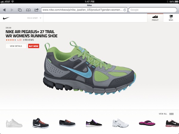
In today’s 24/7 world of business, the most useful website is the one that can be accessed anywhere, not just at a desk. As a result, it’s critically important to ensure that your site plays well with all mobile platforms and devices, including touchscreens and tablets.
Pull your company’s website up on your phone. Then pull it up on your friends' phones. Then pull it up on every modern mobile OS that you can get your hands on. If you can't bring it up, browse through it, view the content and complete core functions effortlessly, then neither can your users.
In order to ensure that you’re providing the best possible user experience for those on small screens, you must make sure that your site’s interface is clean and clutter-free so that you make optimal use of the available real estate to allow the most important content to take center stage.
Also pay close attention to details such as the amount of time it takes to load your site via mobile networks, the size and readability of typography, the level of contrast between the text and the background, the function of menus and the “pressability” of links, buttons and navigational tabs.
5. Is your site touch-friendly?

With the explosive growth in the adoption of touch-driven smartphones and tablets, the likelihood is increasing with every passing day that customers will be traveling around your website using touching and swiping gestures rather than the clicking and scrolling action of a mouse and keyboard.
To create finger-friendly navigation, all links, buttons and menus must be big, bold and obvious and have a buffer around them to allow a greater margin of error. In the world of touch, roll-overs and hover states are non-existent, so replace buttons that require users to mouse over them to get a sense of action with style enhancements that draw attention to them as action elements.
Again, the only way to be confident about how your site rates on the touch-friendly scale is to put it through the paces on actual touchscreen devices. If you don’t already own such a device, borrow one or – if all else fails – make a trip to your local retailer and use the display models there. It’s worth a little legwork to ensure that you’re providing the best possible quality experience for the growing legions of touch users.
Read more:
Is Your Website Ready for the Tablet Revolution?
6. Is it Flash-free?

The mobile Web is officially a hostile environment when it comes to Flash. Apple’s iOS does not – and probably never will – support Flash. Android does support Flash, but the performance of Flash content on Android devices thus far has been less than ideal.
If you have Flash anywhere on your site – whether it’s in the introduction, your navigation framework or video – get rid of it now, or else most mobile users will be plagued with problems.
Today there are better, more lightweight and touch-friendly options available, such as HTML5 and JavaScript, that can replicate the same effects that once required Flash.
7. Is your site supported by a content management system?

Publishing unique, high-caliber content to your site on a regular basis is a crucial element of today’s marketing that is integral to helping your company conquer many key business growth objectives.
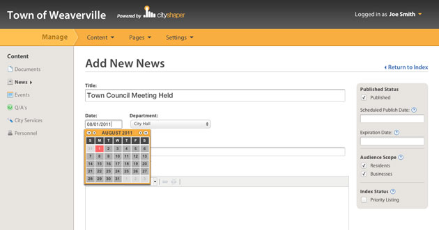
The only way to achieve this efficiently and cost effectively is to have a content management system behind the scenes of your website that allows designated administrators within your own company to create and post certain content types – such as blog posts, company news, event information and press releases – within the existing framework of your site. A solid, robust content management system will make it easy and intuitive for almost any user to publish sophisticated, engaging content that includes photos or videos and follows graphical style conventions that maintain a cohesive look and feel with your site as a whole.
8. Is there a way for users to subscribe to receive updates?

It takes a lot of effort to find and entice new qualified visitors to your website, but the greatest payoff comes when you can grab these users and convince them to come back again and again.
Don’t put the burden on them to remember to check in every so often to see what’s new on your site. Make sure they have the option to subscribe to receive updates either by RSS feed or email so that when you publish a new blog post or send out your next e-newsletter, you’re in their feed reader or inbox, prompting them to click through and dive into your latest content.
9. Is your site free of black-hat SEO techniques?
If your website has ever been in the hands of a less-than-reputable developer or SEO “expert,” there may be dangerous black-hat SEO tactics in play that are putting your site’s performance in organic search results in serious jeopardy.
Black-hat tricks like keyword stuffing and invisible text are the crutches often employed by snake-oil SEO practitioners to artificially improve the position of a website in search engine results pages for specific terms or phrases. However, the problem is that all of these illegitimate methods are condemned by the major search engines, which are programmed to weed out and penalize imposters.
While these techniques might provide a temporary boost, when they are uncovered by the search engines (and they inevitably will be), your site will be blacklisted, and you’ll be off the map completely when it comes to organic search. There’s no short-term benefit that’s worth the cost of such a great potential risk.
10. Do you have tools to track the metrics on key conversion points?
Where do visitors to your site come from?
What keywords are they using to find your site?
Which pages do they visit most often?
Which pages might be turning them off and sending them elsewhere?
How many visitors leave after viewing only one page?
How long do visitors tend to spend on your site?
The answers to all of these questions are critical to helping you shape your site and adapt your online marketing efforts to maximize conversions. However, unless you have the required tracking code in place in the underpinnings of your site to tie into a metrics toolset like Google Analytics, you’ll find yourself with major gaps in the information you need to make crucial decisions that affect the growth of your business.
How did your site rate?
If you’ve answered “no” to several of these questions, it’s time to move overhauling your site to the top of your business growth priorities list.
By partnering with a top-notch website design firm, the initial investment required to redevelop your site to meet these criteria will be returned to you many times over in the lifetime value of the new customers you’ll be able to capture with a site that offers a powerful and engaging experience to users on any and every platform and device.
Behind every superstar website there is an architect, scrutinizing every single detail, cutting through the nonsense, and challenging every aspect to craft a masterpiece that gets noticed and gets results.