Designed to Inspire: A Showcase of Powerful Nonprofit Donation Pages
December 2011
By Jeremy Hunt
For most nonprofit organizations, donations are their lifeline. Raising awareness for the cause is important, but it's contributions from the public that keep the lights on and provide the fuel to fulfill their mission.
Good website design is crucial for any business competing in today's marketplace, and nonprofits are no exception. The design of a donation page can make or break a potential contributor's decision regarding whether or not to give to an organization and, if so, how much.
Here are four examples of simply but powerfully designed donation pages that connect with donors to keep the coffers full.
American Red Cross

The
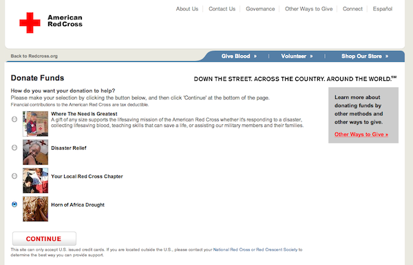
donation page for the American Red Cross shines in its simplicity. While the scope and depth of the organization's work is far-reaching, they make the process of supporting their efforts very straightforward.
All too often, nonprofits give donors many different ways to give in hopes of catering to their personal preferences. However, this can actually have the opposite of the intended effect by muddying the mission or overwhelming potential contributors with too many choices.
The Red Cross succeeds by taking a different approach: they streamline their many diverse efforts into four giving categories (Greatest Need, Disaster Relief, Local Chapter and African Drought) to make the choice to give clear cut and simple. They also leave the door open for those who might be interested in other options with a separate traffic funnel in the right-hand sidebar area.
With so many organizations competing for donor dollars, it's critical to present options that are easy to grasp, resonate with contributors and provide strong motivation to give.
Salvation Army

The
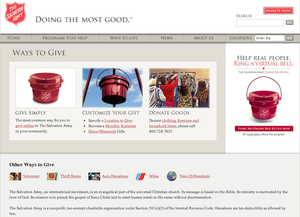
Salvation Army’s donation process epitomizes ease of use, a trait that goes hand-in-hand with providing straightforward giving options.
The layout of the page is simple but highly effective, with eye-caching images that are not only visually appealing but provide strong navigational cues directing visitors to three simple but distinctive giving paths: monetary donations, a customized gift or gifts in kind. Again, if the user desires, there are more nuanced options available as well. But keeping the most popular options front and center is a great way to draw in first-time donors.
Compassion International

Emotional engagement is key to drawing in potential supporters.
The
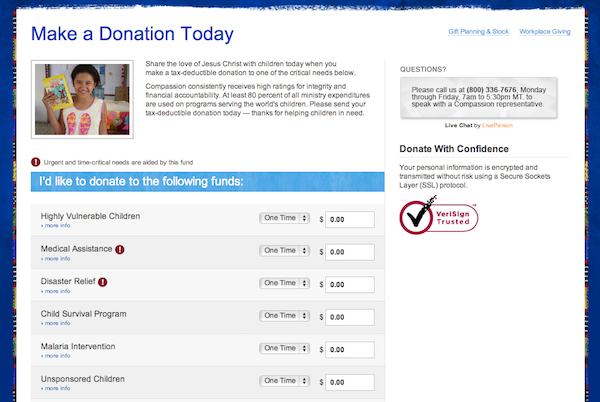
donation page for Compassion International does a great job of making that emotional connection on a couple of different levels. First, the giving options are presented strategically in terms of the types of needs that potential donors can help the organization to meet. The wording of these needs (i.e., “Highly Vulnerable Children,” “Disaster Relief,” “Child Survival Program,” etc.) conveys a tangible sense of immediacy to engage visitors right away. Second, areas of most immediate need are flagged with red exclamation points. This subtle but effective visual detail attaches an added sense of urgency to these options.
Come&Live!

Come&Live! is a nonprofit ministry focused on supporting musicians and the arts community.
Their online donation process is strikingly simple. It begins with a call to action on the home page that's as straightforward as it gets: “Donate. We Need Your Help.” When visitors click on this banner, they're taken straight to the
donation page, which consists of one brief form. Designate the amount of the gift, fill out the necessary personal information and you’re done.
Keep it simple and powerful
The task of raising the funds needed to sustain any nonprofit is no easy task, but a well-designed donation page can greatly multiply the efforts of your human resources.
And as these four examples show, the best, most effective approach is almost always the most simple and straightforward, keeping the primary focus on making a strong emotional connection between your mission and the passion of potential donors.
Jeremy Hunt is a writer, communicator and social media grunt who lives in Charlotte, North Carolina. He currently serves as the manager of corporate social media for Novant Health. Keep up with all that he finds cool in the world at jeremyhunt.tumblr.com or follow him on Twitter: @jehuthehunt.