How to Arm Your Site for Every Screen and Every Platform: An Introduction to Responsive Website Design
December 2011
By Thomas Hardy
What is responsive design?
Responsive design is the concept of building a website so that the layout of the site adapts and changes according to the resolution of the user’s browser.
In plain English, employing responsive design allows you to build a single site that will look just as good on a monitor that’s 2048 pixels by 1080 pixels as it will on an iPhone that’s 320 pixels by 480 pixels and all browser sizes in between without the need to build a separate dedicated mobile or iPhone-specific version of your website.
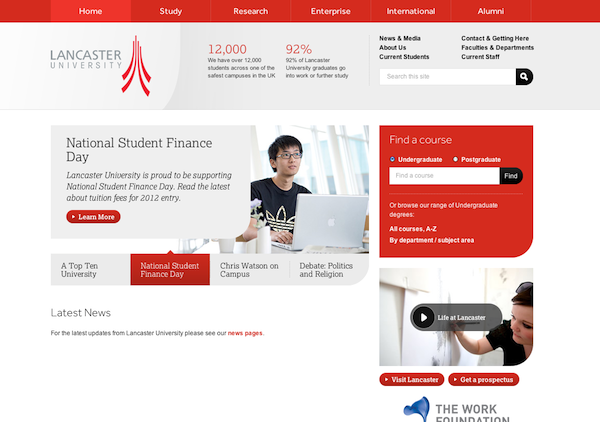
The best way to get a feel for responsive design is to see it in action, and one of the best examples is the
Lancaster University website.
If you simply open the site in your desktop browser, you won’t immediately notice anything extraordinary. However, if you slowly adjust the size of your browser window, you’ll begin to see how the design adapts to the width of the window on the fly.
The change is more than just a straightforward scaling effect; rather, certain key elements within the design shift and transform according to the resolution of the browser.
For example, this is what the website looks at 1024 pixels wide.

And this is what the website looks like at 640 pixels wide.

As you compare the two, you’ll notice that in the smaller version, the two stats next to logo disappear, allowing the quick links, search bar and logo to fit into the width of the browser and remain usable. Also, the “Find a Course” box and the two information boxes are now displayed alongside “Latest News,” which preserves the usability of the tab-based navigation in the main feature.
This is what the website looks like at 480 pixels wide.

You’ll now notice that the primary navigation transforms from one row of six links to two rows of three links, which ensures that these links remain large enough to be easily pressed with a finger on a touchscreen phone.
The quick links are reshaped into a drop-down-style menu that takes up less real estate on the screen but still allows the user to easily access these important links.
The search box moves to the bottom of page, and the “Find a Course” box disappears and is replaced with a link to the course search page.
On the main feature, the slider changes from tab-based to next/previous-style navigation.
Why is responsive design important?
As you can see from the Lancaster University example, adapting the layout of the site based on the browser’s resolution ensures that all content is easily accessible no matter where or how a user might be browsing.
With the explosive growth in tablets and smartphones, IDC predicts that within the next four years,
more people in the U.S. will access the Internet via mobile devices than via desktops or laptops.
As a result, it’s important to take steps now to make sure that your website is not only accessible but easy to navigate and use on any device and any screen size in order to keep pace with the ever-changing browsing preferences of your clients and customers.
Thomas Hardy is a freelance web designer from Newcastle upon Tyne (UK), here is his portfolio. He founded Design-Heaven and Work-Killer, where he regularly blogs. You will also find him on Twitter and Facebook.