10 Steps to Conquering Twitter Through Trustcasting

A simplistic platform with complex rules
As a vehicle for communicating with customers, Twitter is a deceptively simple platform that, in reality, is a challenge to truly master.
First, there’s the format. How do you develop meaningful relationships 140 characters at a time?
There’s also the overwhelmingly expansive size of the community. With 200 million registered accounts in the Twitterverse, how do you attract followers that
belong to your tribe and will help your business grow?
Furthermore, there’s the staggering pace of the flow of information and dialogue. With an average of 110 million new tweets every day, how do you make a meaningful contribution?
Each of these complex questions share the same answer:
trustcasting.
As we established in the
Trust Manifesto, “In a marketplace founded by, built by and existing for the people, trust is the only fundamental currency.”
The results you yield from your participation in the Twitterverse will only ever be as good as the time and effort you invest in earning trust and developing genuine relationships with others.
If ever there were an ecosystem built by and existing for the people, it’s Twitter. Each user is the sole arbiter of who is and is not granted permission to be present in their feed. Each and every user is judge and jury of good and bad content; the interesting, relevant stuff gets elevated and passed along to their own networks while the boring, self-serving stuff withers and dies out quickly.
The one and only way to break through is by engaging in an ongoing process of building and maintaining trust. Following the golden rule of trustcasting, everything must be centered around developing authentic and reciprocal relationships between your company and other members of the community – a process for which no shortcuts exist.
The results you yield from your participation in the Twitterverse will only ever be as good as the time and effort you invest in earning trust and developing genuine relationships with others.
Here are 10 essential steps you must follow to conquer Twitter by adhering to the principles and practices of trustcasting:
1. Be one with the medium.
Before you dive in and make potentially embarrassing or even reputation-killing public blunders, observe the ways in which other more experienced users engage and interact with each other to get the lay of the land.
Nothing screams “Imposter!” like someone who goes tearing through the Twitterverse like a bull in a china shop with no regard for the nuances of the community.
By showing disregard for the unique language and customs of the Twitter ecosystem, you also show that you’re disinterested in serving anyone’s interests other than your own.
2. Step out from behind the corporate curtain.
While the old familiar rules of marketing would dictate that your handle should be your company name and your avatar should be your logo so that your brand is always front and center, Twitter isn’t a collection of brands on a shelf but a living, breathing community of people.
If your customers encounter a faceless brand, they don’t know if the person behind the curtain is the great and powerful Oz or your summer intern. It’s much more natural for your followers to have an authentic conversation with a human being.
Set up your profile with a photo of yourself and a bio that tells us more about you than your official job title while remaining transparent that you also represent a company.
Make sure to let your personality to shine through and to allow your interactions display human qualities – whether it’s candor, humor, generosity or even humility. By allowing members of the community to get to know you on a personal level, you open the doors to a deeper level of engagement.
3. Find real people you can have real conversations with.
With so much buzz around the concept of influence on Twitter, it’s tempting to go chasing after the users with the highest follower counts and try to entice them into your circle, knowing that one retweet will reach thousands of potential customers.
However, it’s more important to find members of your tribe – those whose interests and needs align with the products or services you offer – who will be receptive to what you have to say.
A good way to find these people is to regularly search for users in your area who are talking about subjects relevant to your offering. For example, let’s say you’re a dog trainer. You could enter the search terms “puppy near:Charlotte within:20mi” to pinpoint users near you who might be interested in the tips, articles and offers you have to share. By following them or replying to their tweets when appropriate, you’ll increase the likelihood that they will follow you in return.

As you build a friendly rapport with this group of core followers, others will take notice and want to join in the conversation. It will be as if you are at the head of the cool kids’ table, and they want to pull up a seat.
Contrast that with a scenario in which you have amassed a list of supposedly influential users who ignore your content and never respond to you. Where did all the effort to win their follow leave you?
4. Give before you expect to receive.
The holy grail of Twitter is transforming your followers into evangelists who retweet your content through their networks and give it legs to travel far beyond your immediate circle of influence.
However, you can’t expect the rewards if you don’t put in the work. It’s up to you to find or create interesting content that’s worthy of a share.
Promotions and giveaways are easy fodder for sharing, but they’re not the only share-worthy material. A link to a thought-provoking article, an inspiring quotation or a helpful how-to video are also highly sharable. Even if the content isn’t originally yours, you’re doing a service to your community by finding good information and passing it along.
5. Put sales objective second to trust objectives.
Twitter is a medium, not a broadcast channel.You’ll only be successful if you approach it as a means to cultivate a tribe of people you’ll enjoy conversing with, learning from and sharing with rather than a tool to give you unlimited access to a captive audience that you can barrage with marketing messages at will.
Don’t engage followers as a brand with an agenda to sell but as an ambassador for your brand with intentions of making a meaningful contribution.
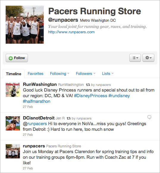
For example, let’s say you own a store that sells running gear. You should make it a regular practice to pass along links to local races, share articles from around the blogosphere about good running form and nutrition, offer helpful tips to users who tweet about their struggles staying motivated and give shout-outs to customers who have achieved personal milestones like completing their first 5k.
Without ever posting a direct link to a product, you can allow prospective customers to reach their own conclusions that you are the kind of company they want to support when they’re ready to make a purchase.
6. Reach out.
Remember that Twitter is, in essence, one sprawling public forum. As a result, you don’t have to sit back and wait for someone to approach you. It’s perfectly acceptable to jump into the conversation, as long as you follow the rules of trustcasting in doing so.
Don’t be disruptive, and don’t go straight for the kill with a hard sales pitch or a link to your website. If you see an opportunity to join in a dialogue with something insightful, helpful or even funny, go right ahead. You might get a response or a follow in return for your efforts.
More importantly, over time, you’ll cultivate a reputation for being a trusted source of interesting, useful or entertaining information, and your company and your brand will reap the benefits of your perceived authority in these areas.
7. Be responsive.
Always be responsive if someone directs a question or comment your way. It’s smart to keep tabs on mentions of your name or the name of your company so that you can reply as quickly as possible. Attention spans on Twitter are short, and if hours pass before you respond, chances are good that the person has moved on, and you will have missed the window of opportunity for a good two-way dialogue.
It’s also important to be an equal-opportunity responder. While it’s always fun to reply to someone who is raving about your product or service, it’s dangerous to ignore those who have complaints. Respond to your critics with sincere concern and express an earnest interest in making things right, just as you would a dissatisfied customer who was standing in front of you in your store.
Even if your efforts are rebuffed or ignored, you will have done your best publicly to demonstrate that you have their best interests at heart. In trustcasting, respect for the customer is paramount.
8. Be the kind of follower you want to have.
One of the best ways to earn goodwill in the Twitterverse is to promote others’ content.
When someone you’re following shares a link to a thought-provoking blog post, news article or video, retweet their content, giving them credit for their great find.
Elevating other members of the community is a simple, selfless act that demonstrates that you’re there to do more than toot your own horn.
9. Let your guard down.
The best thing social media – Twitter included – has done for business is removing the barriers that once stood between companies and their customers. No longer are you bound by the restrictions of mass media channels; instead, you can interact directly with your customers on a personal level.
Therefore, your participation on Twitter must follow the rules of
the culture of the Web. If you insist on holding your followers at arm’s length and only allowing them to see a perfectly polished version of your company, you won’t get the most from your efforts.
Instead, go with the flow and keep it real. Your tweets are essentially part of a long-running chat. Keep your tone light, casual and approachable.
You can even give your followers the occasional behind-the-scenes glimpse into daily ins-and-outs of your business. If you own a bakery, and you tweet a photo of your chef hard at work making your signature dessert, it’s a great way to remind your followers that they can swing by and pick up a freshly baked, handmade treat without explicitly asking them to do so. And they’ll feel more invested in your success because they will feel more connected to the people behind the name.
10. Be patient and persistent.
You won’t be an overnight Twitter sensation. You may not ever play on the level of Martha Stewart or Ashton Kutcher. But you also don’t need millions – or even thousands – of followers to make your participation worth your while.
At its core, Twitter is a high-tech version of traditional grassroots marketing. You must build your community one follower at a time.
Keep your focus on the quality of your community and the depth of your interactions, both of which you must allow to grow naturally and organically. In trustcasting, there’s no substitute for honest intentions and hard work. But while earning and maintaining the trust of your followers is a more indirect path to business growth than conventional carpet-bombing sales and marketing tactics, it will ultimately allow you to achieve the greatest return in securing ownership of your market.
Great authors are defined by their ability to set fire to the written word. All too often in today's digital information age, that creative spark is stifled, leaving the Web littered with content that is lifeless and ineffectual. Fame Foundry's Author has made it his mission to revive the act of writing as an art form, harnessing the power of language to command attention and ignite a following. It's the difference between telling a story and building a legend.