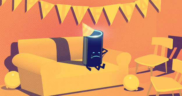
Is Your Promotion Ready for Prime Time? Seven Make-or-Break Lessons in Staging a Successful Retail Sales Event from Amazon
November 2015
By Jeremy Girard
 With the holiday season just around the corner, talk of “Black Friday” and “Cyber Monday” sales have already become practically unavoidable. These two retail sale juggernauts have become so deeply entrenched in our cultural lexicon that they actually shape consumer behavior, as eager shoppers anticipate and plan around their arrival for weeks or even months ahead of time. But what if you want to go your own way? Can you conceive of your own unique promotion that will excite consumers and jump-start spending behavior on par with Black Friday? This was the very challenge Amazon attempted to tackle this past summer with their “Prime Day” promotion. Coinciding with the company’s 20th anniversary, Prime Day was a one-day sale that was promised to include “more deals than Black Friday.” Amazon flooded the marketplace with advertising in advance of Prime Day and whipped up great excitement and speculation among customers about what types of deals might be offered. However, when Prime Day arrived and the sales rolled out, the reaction was decidedly less enthusiastic, with many underwhelmed shoppers turning to social media to express their apathy, disappointment and even downright disgust. In the end, Prime Day was not the colossal failure that the Twitterverse would have you believe. In fact, just a few hours into the day, Amazon sent out a press release claiming that “peak order rates have already surpassed 2014 Black Friday.” Moreover, “Prime members have already bought tens of thousands of Fire TV Sticks, 35,000 Lord of the Rings Blu-Ray sets, 28,000 Rubbermaid sets, and 4,000 Echo devices in 15 minutes. The Kate Spade purse was gone in less than a minute. We also sold 1,200 of the $999 TVs in less than 10 minutes. And there are thousands more deals coming.” While Prime Day may not be the next great retail phenomenon, Amazon’s venture into inventing a new sales holiday offers several valuable lessons in the do’s and don’ts of crafting a successful promotional event:
1. Build buzz around your promotion.
One thing that Amazon did right was building up excitement in advance of the event. They ran advertising for weeks leading up to Prime Day, yet they kept the specifics about the deals that would be offered under wraps, leading to great speculation among Amazon enthusiasts about the kind of fantastic steals they might be able to score. Many of these shoppers even logged on early to try to capitalize on the sale. Any successful promotion starts with hype. You must have a plan in place to build excitement and get people talking so that once it begins, you have a eager customers ready and waiting to jump on board. Of course, hype is just that. It should be the drum roll leading up to the big finish. Otherwise, it’s just an empty promise that will result in disappointed (and distrustful) customers.
2. Deliver on the expectations you’ve created.
By far, the biggest point of failure for Prime Day promotion is that many customers expected much more than Amazon ultimately delivered. The majority of the complaints about Prime Day centered around the lack of perceived value or desirability of the discounted items. 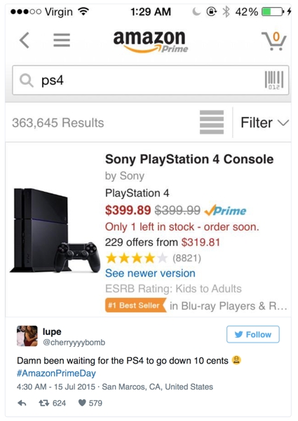 Typically, during Black Friday and Cyber Monday, retailers tease deep discounts on highly desirable items (such as TVs, gaming consoles and premium brand products) to get shoppers in the door, counting on them to scoop up other items that they want to unload in the process. But on Prime Day, the best deals centered around Amazon’s own tech gadgets, like their Fire TV stick, Kindle and Echo, while many of the other products that were included, such as dishwasher detergent, socks and even a 55-gallon barrel of lube, were much less attractive and left many customers feeling underwhelmed. Furthermore, Amazon front-loaded the hottest deals at midnight PST, so by the time most customers jumped online in the morning, everything had long been sold out. While Amazon has the numbers to prove they sold tons of item during Prime Day, there’s no denying that, for many customers, they did not meet the expectations that they established in the pre-sale campaigns, leaving the retailer with a major black eye in the court of public opinion. When planning a promotion, be sure that you live up to the hype you create. If your focus is on marketing the promotion instead of on the promotion itself, then you are setting yourself up for disappointed customers.
3. Remember: bigger does not always mean better.
Looking back at Amazon’s pre-sale campaign messaging, you will notice that they refer to Prime Day as being bigger than Black Friday and having “more deals.” Nowhere could I find any mention that Prime Day would be “better” than Black Friday, just that there would be more deals offered, which is a perfect example of the old adage that “bigger does not always equal better.” 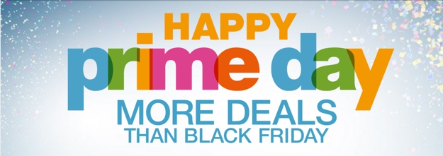 Item for item, Prime Day may have indeed had more to offer than Amazon did on Black Friday, but that didn’t matter to most customers. People don’t necessarily want tons of options, they just want the right ones. When planning your own promotions, think big, but also ensure that you do not sacrifice quality for quantity. Instead of focusing on offering a wide array of deals, go the opposite direction and think about personalizing your promotion. These days, with the abundance of traffic analytics and customer account data available, it’s easy to know what your customers shop for and purchase most often. Use this information to your advantage and craft customized offers that reward your loyal shoppers with discounts on the things they really want and need. And for goodness sake, notify them ahead of time that their favorite items will be on sale! This is definitely one area where Amazon really missed the boat. After all, who has more customer data and marketing intelligence than one of the Web’s biggest retail giants?
4. Don’t try to please everyone.
The fact that we are talking about all the complaints that people had about Prime Day is interesting in and of itself. After all, this is a sale we’re talking about! People are actually upset that the deals offered weren’t good enough! That’s the very definition of a First World problem and it shows that, no matter how hard you try, you will never please everyone. When planning a promotion, consider your customers and what they want, but don’t get too hung up on trying to include something for everyone. Doing this can force you to go to market with a campaign that is unwieldy and unfocused, and no matter how hard you try, there will always be someone who complains that they did not get what they wanted. Do your best to set and meet expectations, but also be prepared to hear complaints, and accept that this is part of doing business.
5. Motivation is key, and timing is everything.
One of the key reasons Prime Day was not a bigger success is that the motivation behind the event was driven by Amazon, not it’s customers. Amazon decided that they wanted to stage a huge promotion in the middle of the summer to celebrate their 20th anniversary. But what does that have to do with me, the consumer? Nothing at all, really. As Ed Stevens, CEO of Shopatron explains, Amazon’s chief failure was that they neglected to tap into any real time- or emotion-based motivation for their customers: “Prime Day will in no way replace Black Friday. The primary reasons for this include the amount of consumer discretionary dollars in July will not change. Consumers are most motivated to spend their money when it’s associated with an event, and most holiday sales are centered around a sentimental or emotional gift giving component…Prime Day is an unsentimental, ordinary sales gimmick akin to a car dealership having a Labor Day blowout sale.” Everyone knows that the key to making a sale of any sort is to instill a sense of urgency in the buyer. July is far removed from any major gift-giving holiday, so as a shopper, the idea of Prime Day as an early Black Friday is null and void. Unless there’s something I want for myself and happen to find an unbeatable deal on, I’m not likely to part ways with my money on this particular day just because a company tells me I should. When you’re planning your next big promotion, make sure the timing is right, and that you’re tapping into motivations that are relevant to your customer base. If you own a stationery shop, you can run a promotion timed to coincide with brides who are planning for the summer wedding season. If you run a sporting goods store, it doesn’t make sense for you to run a Valentine’s Day sale, but it does make sense for you to plan promotions tied to the beginning of each new sports season for adults and kids needing to gear up for spring baseball or fall football and so on.
6. Make it easy for your customers to participate.
Another one of the chief complaints about Amazon’s Prime Day was the way in which offers were presented: an infinite scroll of items presented five at a time in no particular order which continued on for hundreds of pages. Who wants to wade through that for the chance at finding something they might want at a price they might want to pay for it? 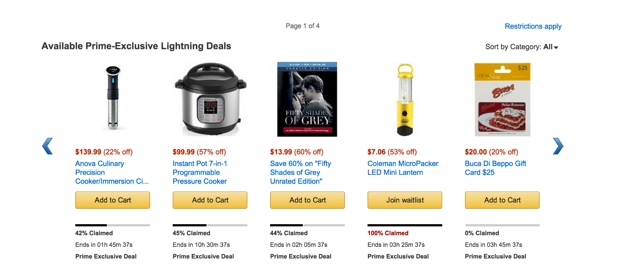 If you’re going to run a promotion, don’t make your customers work hard to make you money. People love a good deal, but only to the extent to which it doesn’t cause them an excess of inconvenience. Don’t forget: there’s always a competitor lurking in the wings to give your customers what you fail to deliver.
7. Accept that you will have a target on your back.
With Prime Day well underway and customer reactions starting to roll in, Walmart jumped into the conversation by offering a number of their own “Rollback” deals. They were able to sit back and see what Amazon was doing and then respond in a way that would allow them to try to trump Amazon’s big sale – and for many customers, this move worked as they found (in their opinion at least) better deals on Walmart.com. What does this show us? That the first one to do something is the one with the target on their back! After all, it is always easier to follow rather than to lead. By waiting to see what Amazon had up their sleeve, Walmart was able to evaluate the situation and respond, instead of taking the leap and being first into the fray. This is a reality for any company that forges into uncharted territory, since it allows your competition to learn from any mistakes you make and build upon the path that you establish. Does this mean you should be reactive rather than proactive in your promotional strategy? Not at all. Many companies that were “first in” benefited from that position. eBay was the first company to do online auctions, and sites that tried to follow in their footsteps slowly failed and closed up shop while eBay remains a powerhouse. Sometimes, the first one in wins the day, but other times, they end up being the target that everyone else comes gunning for. Ultimately, though, it’s good planning and solid execution that are the differentiators between a promotion that soars and one that sinks.
Jeremy Girard has been designing for the web since 1999. He is currently employed at the Providence, Rhode Island-based firm Envision Technology Advisors and also teaches website design and front-end development at the University of Rhode Island. In addition, Jeremy contributes regularly to a number of websites and magazines focused on business and the Web, including his personal site at Pumpkin-King.com.