Fit or Fad?: Choosing the Right Social Media Networks to Connect with Your Customers
May 2012
By Jason Ferster
This just in...
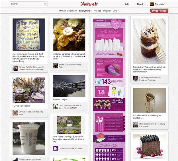
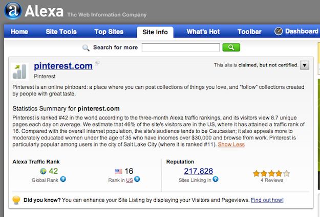
Pinterest is now a marketing tool for business. That is, if the chatter emanating from LinkedIn groups and marketing white papers is any indication. Yes, there are already white papers. In just over a year, Pinterest has edged its way up the Alexa rankings to claim a spot on the 50 most visited sites in the world. It has even surpassed such well-established powerhouses as PayPal, CNN, Netflix and The Huffington Post to claim its stake as the #16 most visited site in the U.S. “But what the heck is Pinterest?” you may be wondering. I’ll let this hot new social site pin it down for you: “Pinterest lets you organize and share all the beautiful things you find on the web. People use pinboards to plan their weddings, decorate their homes and organize their favorite recipes.”  Wait a minute…this bastion of all things bridal, bed sheets and baked goods is now big business? Really? How did this happen? And what does it mean for your business, if anything?
The quick and the dead
Social media is the new wild west of marketing…at least it often feels that way. In just the past few years, we’ve experienced a revolution in the way information about our world, our products and our customers is collected and shared. Connections are raw and direct with little room for error. As a result, it’s no surprise that 140-character faux pas from high-profile tweeters have become evermore commonplace – not to mention the number of noteworthy public scandals brought to light by social media missteps. And then there’s complexity of the social landscape, which changes like the Nevada desert – a few boulders (Facebook, Twitter, LinkedIn) surrounded by a sea of shifting sand, posing a challenge to any business to keep pace. So in this environment of constant flux, how do you remain relevant and cutting edge? How do you balance caution and agility in responding to new platforms? How do you make the most of limited resources? And who’s going to do all this posting, tweeting, +1ing and pinning, anyway? After all, not every business has the luxury of a dedicated, in-house social media guru.
Here’s the good news…
Using the right social media tools in the right way is far more important than using every tool in the box. A carefully curated approach can create stronger ties between your company and your customers while providing the greatest return on your investment of resources. Here’s a step-by-step guide for identifying those networks that are the best fit for your business model, capabilities and customer base.
1. Know where your peeps are.
For major consumer brands like Coke, Nike, Comcast and other B2C juggernauts, it’s important to be everywhere. Fortunately though, they also have the budgets and the manpower to sustain such efforts. Your brand, on the other hand, probably doesn’t need to be everywhere; you just need to figure out where it’s best to be. The key to maximizing the value of your social media efforts is knowing where your customers live online. Just as with all marketing efforts, success starts with knowing your audience, their habits and preferences. If the type of customer you serve isn’t likely to be active on Twitter, there’s no need for you to invest your time there. On the other hand, if your target is young moms, up-and-comer Pinterest is probably a great place to connect with these individuals.  Don’t be afraid to stop investing resources (human or monetary) in poor performers. For example, I work for a consulting firm that manages enterprise software projects for utilities. Because the corporate culture of these types of companies tends to evolve very slowly, many of our prospects were still blocking employee access to Facebook and Twitter until just recently. So, historically, those outlets have offered our firm little lead-generation value. However, nearly everyone I meet has a LinkedIn profile, so our firm has a strong presence there, with many of our staff actively involved in LinkedIn groups. Find where your people are and join the conversation.
2. Align social media with your business model.
Every social media site has its own strengths and benefits, so it’s up to you to determine which ones best enable you to showcase and promote your products or services. Full-platform sites like Facebook and Google+ offer the greatest flexibility and the broadest audience, but there may be others that can better serve your unique marketing goals. For professional photographers, sites like Flickr and Instagram make it easy for people to discover and share your work. They’re also where you’re most likely to connect with people who are passionate about great photography. On the other hand, sites like Groupon, Yelp, Zagat and Foursquare are built around local deals and local reviews. If you’re a brick-and-mortar shop, these sites can help boost your traffic – the kind that walks through the door with cash to spend. Consumer products – especially those that are design or taste oriented such as fashion, housewares and tech gadgets – are likely to perform well on sites like Pinterest that let users curate collections of things they like. And if you’re in a B2B business, LinkedIn and Jigsaw are great sites for building your network and working leads while Q&A sites like Quora and Focus offer a platform to showcase your expertise and build trust with prospects by answering questions posted by the community.
3. If you show up, come ready to engage.
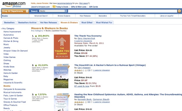
With social media, you get back in proportion to how much you give. If your company makes the commitment to join a community, you must be prepared to become an active an engaged participant in it. You can’t expect your tribe to accept you and – more importantly – follow your lead if you’re not willing to put in the work to contribute something of value to their community on a consistent and ongoing basis. It may take a while to gain momentum, but as you get to know a community’s values and style of interaction, your sphere of influence and the marketing capital that comes along with it will grow steadily. Fame Foundry friend Gary Vaynerchuck lives on Twitter. He has over 900,000 followers and can stir a mass of them to action at will. I have experienced this phenomenon firsthand, having watched (and participated) in amazement as Gary went on a one-day Twitter binge to push his book The Thank You Economy to the number one spot on Amazon on the day it was released. Although he did not hit number one on the bestsellers list, he did make it to number six…and number two on the “Hot New Releases” list…and number one on the “Movers & Shakers” list, increasing his sales by over 200,000% within 24 hours.  That’s the power of becoming an integral part of a community, a leader of a tribe that speaks and is listened to. What kind of blitz for your business could you create with 500, 5,000 or 500,000 followers?
4. Don’t be lazy.
When you post new content on one site, it’s awfully tempting to syndicate – or rebroadcast – it everywhere else. For example, it takes no effort at all to republish your Twitter feed to your Facebook Page or LinkedIn profile. It’s so easy, and there’s no harm in doing it, right? Not necessarily. Your Facebook fans might not appreciate having their news feeds cluttered with your tweets and retweets. And LinkedIn isn’t necessarily the right venue for all the casual exchanges you might participate in on Twitter. It’s a right time/right place/right manner thing. Let’s be clear: I am not saying that you should post content in only one place. I am saying that it is best to adapt that content to the needs, expectations and etiquette of each community. You must shape and massage your content to make it relevant to both the platform and the people. For example, let’s say your business is hosting a special event. You can live-tweet the event as it unfolds, publish a recap of the highlights on your company blog, post pictures from the event on Facebook (particularly if you’re “tagging” participants in the photos), make the presentation slides available on LinkedIn or SlideShare and host follow-up discussions on a proprietary business forum site. You’re still getting great social media mileage from this one single event. But by tailoring your content to the interests and preferences of each community, you’ll give people a reason to follow you in more than one place while preventing information burnout for those who already do.
5. Don’t overlook the easy targets.
Some social sites truly are “set it and forget it,” giving you invaluable exposure while requiring relatively little active involvement. These are reference and review sites for which the benefits of being represented far outweigh the minimal monitoring requirements. If you’re a local business, be sure to keep an eye on word-of-mouth review sites like Yelp and Zagat. Make sure the information listed about your company is accurate. Check in bi-weekly or monthly to see how reviews are fairing. Respond to negative feedback in order to make things right.
A more difficult but highly rewarding option is to establish a Wikipedia entry for your company. While there are a few hurdles you must overcome in order to make this happen, the benefits are tremendous. In addition to further legitimizing your company in the public eye, a Wikipedia entry is a great way to secure a prominent position in Google search results – no sponsored-listing dollars required.
It's not easy, but it is worthwhile.
The underlying principle for all of these tips is that you must put your customers and prospects first. Serve their needs, promote their interests and conform to their expectations of conduct. Share your time and expertise generously and give your fans good reason to like and share your brand and products with their friends. It all comes down to this: to use social media effectively to promote and grow your business, you must find the right fit and then work hard to fit in.
By day, Jason Ferster is the marketing manager of an IT consulting firm, where he contends daily with the marketing challenges common to small and mid-sized businesses. By nights and weekends, he writes about insights gained from those experiences. Visit FersterFiles.com for more or connect with Jason on Twitter.