The Culture of the Web
August 2010
By The Architect

Today there exists an enormous divide between those that understand and participate in the culture of the Web and those that do not.
This chasm runs deeper than just a generation gap, and there’s more to conquering it than simply being born into the Digital Age.
The Internet is a nation in and of itself, and its culture is as real and nuanced as that of any country under the sun. It’s driven by information traveling instantaneously through billions of connections that function organically as a single collective, creating, defining and shaping its own distinct code of conduct, conversation, humor, protocol and even etiquette.
Why is this important?
Nowhere is this rift of understanding more apparent or consequential than in marketing.
For the casual user, it’s not as important to grasp every nuance. However, if you want to do business and make an impact in this self-made, self-ruled culture, you must learn what makes it tick. You must be a part of its collective and discern the unifying elements that drive what its people, its
tribes and its ruling class do, think, accept, feel, follow and react to – and why.
These governing principles aren’t published in any how-to pamphlet or printed on a membership card. There are no clear signs posted along the way. To know Web culture, you must simply be a part of its collective in every way.
Living in the Internet
True mastery of the Web and its culture comes from living and breathing it day in and day out. Reading what’s popular. Participating in discussion. Paying attention to reactions. Observing as the collective expands its knowledge, evolves its sense of humor, chooses what it hates and likes – all building upon a foundation of shared experience.
These are the fundamental aspects that must be second nature to anyone charged with growing your business – whether that’s you or your marketing agency:
Failure to not only recognize and comprehend but also to be active in Web culture will greatly increase the risk that any marketing venture you undertake will be ineffectual and ultimately unsuccessful.
Ruled by tribes of trusted elite
Early on, the Internet began to cleverly devise ways to sift through millions of pieces of information to elevate popular stuff, bury hated stuff or otherwise separate from the unremarkable.
In doing so, clearer vision began to take hold on what was worthy of attention and what wasn’t, based on the collective’s opinion. From this, very active users began to shape the very fabric of the Internet collective, and the organism evolved to trust those in its elite class.
These collections of loud voices that think alike and swarm together can sway nearly anything. Old Spice, Barack Obama, Victoria Secret and Conan O’Brien all know the power of the Internet ruling class. They know who have the megaphones, passion and resources in their market and they had marketing people who were part of those tribes.
Building upon the foundations of the Web’s culture, your marketing entity must know how the ruling classes are formed and how they move in every circumstance in order to execute with pinpoint precision and make waves of customers.
A language and customs of its own
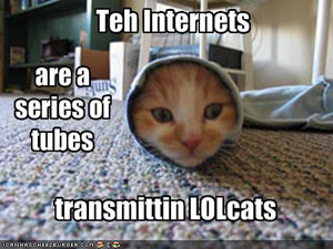
The language of the Web is probably one of the most easily understood and heavily evolved foundations of the collective.
‘LOL’s are somewhat ubiquitous, but if your marketing agency doesn’t know why a ROFLcopter is funny, the essence in the difference between FAIL and WIN or what it means to be ‘pwned’ then, believe it or not, you lack fundamental pieces of understanding needed to take hold of the Internet and communicate with its culture in every way.
Beyond simple shorthand, there is the issue of etiquette and protocol. The Web collective has evolved its own rules for what’s acceptable and what is shunned. It may seem silly, but everything from understanding what it means to encapsulate a word with asterisks to shying away from the investment of personal communication, you or your marketing company must be one with its protocols, even if you aren’t marketing to people that adopt the understanding of.
Like all cultures, knowing your boundaries and assimilating yourself into its protocol is essential to go beyond baby steps. You can get by, but you’ll never truly connect on a mass scale.
The need to belong
In our series on
understanding and marketing to tribes, we covered the anatomy of a tribe—why people connect with each to form followings of an idea and how they collectively rule the marketplace.
The foundation of tribes is passion around something—an idea, lifestyle or movement. The truth is, the Web collective is broken up into thousands of movements stemming from one root motivation: the need to be a part of something.
This is why successful websites whose goals are centered on building a vast and passionate community around its brand or purpose institute point systems and accomplishment badges to reward participation. Understanding why people not only connect themselves to a group or community, but feel rewarded by recognition of contribution to the group is fundamental to connecting with the Web collective overall.
Auxiliary to this is the “15-minutes-of-fame” motivation. Most people are motivated by the opportunity to be featured in higher esteem for outstanding contribution. Elements such as “the most popular photo of the day” or “most video views” reward the creator or contributor by putting him or her in the spotlight.
Addicted to sharing

Members of the collective like to broadcast what they like, what they find interesting, funny, etc. This explains how great ideas go viral.
People inherently want to share things they find striking. When something great happens in the same way its users want to belong, they want to take ownership of it. That great thing becomes a part of them, because it’s a part of everybody.
For example, a funny joke you get from Internet strikes you as hilarious, so you take that joke and you share it with your name on it. A piece of it is yours because you blessed it, posted it, passed it along. Your name becomes part of it. It’s expressing you. Because you found it and shared it, you have partial ownership of it.
In the know
News in the Information Age is available everywhere as it happens. No longer are a select few allowed to report and distribute news. Every member of the Web culture has a cell phone, camera and a way to distribute news at the fingertips.
When events happen, information is moved through the collective, news is discussed, debated, evaluated and classified based on decisions made that organize and shape news within the Web.
As a result, almost all people connected to the Web take very little at face value. Its people are very informed. The culture’s approach to news is one based on hard data and facts, wide-area access and sharing, and the inherent power to sift through the noise and elevate news of importance within its tribes of interest.
Additionally, the Web is the permanent record. It is not a culture that forgets. History is made every day and the decisions of the Web collective serve to build a foundation of information, learning and growing as time marches on.
Web time is real time

Life on the Web moves every bit as fast as the lives of the individuals that comprise its vast collective. The lines between how people behave, relate and interact online and offline are constantly growing less distinct.
The advent of social media has been a defining moment in the evolution of Web culture, as we’ve all become reporters in our own right. The immediacy of sharing has fed the human need for connection, fueling a never-ending stream of status updates, wall posts and tweets.
If someone discovers a favorite new sushi place, their Facebook friends likely know about it before they even leave the restaurant. Likewise, if someone has a negative experience with a customer service rep for their cable company, chances are good they’ll vent about it on Twitter as soon as they hang up the phone.
While this type of information exchange may seem mundane or even meaningless, if you’re the sushi place or the cable company, it won’t be long before you feel its effects. As news and information passes from one circle of friends to another, it adds to and reshapes the collective conscience. As a result, the time lapse between the occurrence of an event and its entry into the greater awareness is shrinking.
You must be constantly plugged in to be able to trace trends and follow the ebb and flow of public sentiment. It’s not enough to be a passive observer on the sidelines; you have to jump in and be one with the community if you want to have a clear view.
A collective sense of humor

More than 250,000 people listen to Jim Gaffigan’s thoughts on Twitter. When a hilarious observation hits, 50,000 people take it, re-tweet it, re-post it and share it with their hundreds of connections, sending it through the veins of Web culture and ultimately assimilating it into its foundation to reshape opinion and unify the collective’s unified sense of humor.
The Internet is just like any small group of people and its various relationships. All of its collective experiences are one big every growing foundation of inside jokes, repeating history and new creations being build upon, carried on, evolved, passed around, remixed and collectively laughed over again and again.
YouTube understood this in 2007, when for April Fools’ Day the video broadcaster made a move to solidify its membership with the Internet collective, hacking its own home page and forced every click to be redirected to the ubiquitous Rick Astley video tied to the mega-meme ‘Rick-rolling’.
Again, knowing why Rick Rolling is funny does nothing for you directly. It’s knowing why it and other Internet memes and viral phenomena are funny to the collective that separates the successful Internet marketer from one just pretending to be one.
An economy of attention
The culture of the Web operates on an economy of attention that is based on self-fulfillment and instant gratification.
In the days when traditional media like newspapers and TV were the primary arbiters of information gathering and sharing, choice was limited, so everything was structured around creating captive audiences and force-feeding them information.
Members of the Internet collective are active seekers and searchers, not passive consumers. Knowing that they have an infinite array of options at their disposal, they pursue only what interests them most, and they quickly dismiss anything that doesn’t immediately grab them as being relevant, meaningful or enjoyable. How quickly?
Research has shown that it takes as little as 50 milliseconds for visitors to formulate an impression and determine their opinion of a website.
As a result, your greatest competitor in the culture of the Web is time. The challenge that you must meet is not only to capture attention but to provide direct meaning and value upfront in order to prove why you’re a place to come back to.
The trust barrier
The Web collective is inherently untrusting. The Internet itself is a nation without laws, and there is always some degree of transparency lacking that cannot be entirely satisfied.
Therefore, it is incumbent upon the collective to sift through its own content and distill the legitimate from the illegitimate. Its members approach this task with a wary eye, looking for reasons not to trust. Anywhere they land, they are on alert for red flags – anything from bad design and fake photos to incorrect information and over-the-top testimonials – that indicate a site unworthy of further time and attention.

Authority is issued from within the collective by way of opinion. Comments, reviews and popularity form the basis for trust, and its people feed off the assessments of other like-minded individuals.
Peer validation is the hallmark of Web culture. No matter what you do or what you sell, if enough people love it and vouch for you within their own circles of influence, you’ll be successful. Without this, you face a significant burden of proof to overcome the natural skepticism of the collective.
Anti-corporate by default
While Web culture is instinctively mistrustful, it reserves a special degree of cynicism for all things corporate. The reasons why abound, but they are in no small part the product of decades of traditional, carpet-bombing marketing and its battery of empty promises, hollow gimmicks and self-serving promotion.
The fabric of the Web collective is comprised of personal connections. Corporate entities are regarded as intrinsically impersonal and therefore existing outside of this culture. In fact, this anti-corporate stance is a point of pride and a rallying cry, creating an environment that is quick to identify and ridicule those companies that don’t understand the culture and its mores. The only ones allowed in are those that earn their way legitimately by building trust through the demonstration of listening and responding to the needs of the collective.
In short, all things being equal, as a corporate entity, you start below zero. Attempting to market to the collective as an outsider that is disengaged from its culture is downright offensive and will result in your brand being at best ignored and at worse severely penalized. This is why trustcasting is essential. The only successful approach to getting and keeping customers in Web culture is through an ongoing commitment to building and maintaining trust – a highly personal approach to business growth that requires developing authentic, two-way relationships within the collective and engaging them with honesty and respect. (Read more about
Trustcasting in the Web Marketing Universe.)
Freedom above all
The spirit of the Web is freedom: freedom of access, freedom of choice and freedom of distribution.
The openness of the Web is the very reason for its existence. As such, the flag flown by the Internet nation is one of self-protection from that which poses a threat to the unrestricted flow of information upon which the Web was founded. Its people promote elements that provide more access and suppress those that oppose it.

The stark contrast in the performance of the business models behind the New York Times and Facebook is one of the best examples of this.
The New York Times, a longstanding bastion of news once regarded within the industry as the nation’s “newspaper of record,” has waffled on its choice of how to deliver information while keeping its traditional revenue model intact, leaning towards a subscriber-based system that restricts access without purchase. While this protects the profitability of the New York Times to some degree, it limits its distribution versus other news sources. Whether this works for the publication or not is really beside the point. The culture of the Web outright shuns the paper’s outmoded approach, openly criticizing it and its decision-makers’ policies.
Facebook hit on success quickly, growing into a billion-dollar company practically overnight. Its model was non-restrictive, allowing unintrusive ads to be run alongside the application rather than garnering revenue through paid access. It is easily embraced by the culture because it is open, provides incredible utility that betters the life of its users and listens and responds to the demands of the collective.
Tech-centric
As the Web itself represents the broadest and most powerful form of technology itself, its people and culture are inherently centered around technology.
Its collective is not only tech-aware, but tech savvy. They want to improve their lives with technology. They want to do more with less.
In their quest to find better information faster and from everywhere, the people that make up the culture of the Web are built on a high-level of understanding for software, hardware and data. The culture is constantly looking for new ideas, concepts and technology that allows the Web to be used in a more useful and efficient manner.
As a result, the Web propagates technology through itself. Its members and ruling class have new technology on high receive and are connoisseurs for new ideas, passing them through the conversation, adapting them to their lives and spreading the word on how it affects their lives.
Celebrity
In the same way the cult of personality has shaped our culture since the advent of television, the Internet collective and its ruling classes proudly evolve its own methods of reaction and shaping celebrity influence.
No one person created the book on Chuck Norris jokes, each an ongoing, comical demonstration of how Mr. Norris’ super-human presence is supreme in every facet. The Internet collective invented, cultivated and spread this ongoing joke with his celebrity. Google itself even jumps on the bandwagon:
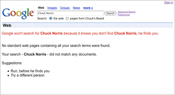
Is this knowledge, by itself, helpful in marketing? No. However, understanding how the Web culture shapes and is shaped by celebrity is the mark of a great Internet marketer.
Knowing what is played out and what will ring with millions is the mark of one that is in touch with Web culture. The Old Spice shower spokesman’s demeanor, speech and jokes are not, in and of themselves, remarkable. It’s knowing the complete package and why it will connect and spread in a way no traditional advertising on any medium could have ever done.
Gaming as a social connection
The Web is one-half work and one-half pleasure. In fact, it could be argued that electronic gaming served as the genesis of the Web collective as we know it today.
Electronic gaming is a core part of Web culture, and the industry commands far more influence than Hollywood. With the evolution of social gaming such as Zynga’s FarmVille and Mafia Wars, every new game published forms its own groups and followings, bringing people together and allowing them opportunities to share their experiences.
Within the collective, language, protocol and humor are just a few of the many facets that continue to be shaped by the massive online gaming community. In the same way celebrities, movies and TV shows have shaped our culture for decades, gaming is not only a fundamental piece of the Internet but a defining touchstone of Web culture.
Homebases
In the Internet universe, people proudly set up shop in various places. Knowing why certain subsets of the collective bind themselves to certain homebases is yet another key to understanding Web culture.
Facebook is ubiquitous. There is hardly a soul that’s not connected to it. However, if Facebook fulfilled everything, Flickr, Tumblr, Twitter, forums and hundreds of thousands of other sites wouldn’t exist.
As an example, photos posted on Facebook are usually for the personal enjoyment of family and friends. Photos posted on Flickr are more prone to be critiqued and elevated based on the critical eye of other photographers. What you think is a good photo in your album on Facebook may not stand out on Flickr or anywhere else.
Knowing the difference between these homebases, the nuances that distinguish one community from another and why people plant their flag in one place and not others is critical when reaching out and building a community of your own.
Greater good

The Web is like any other nation. It is crafted by people for people. It not only represents a collective consciousness but a collective with a conscience. Its members recognize problems and flock to help those in need. Like any other good democracy, its people not only look to better their own lives but also the lives of others.
The power of the Web to shine a spotlight on the ills of society and instantly raise awareness among millions of the problems in the world is a phenomenon never before seen in human history. Because knowledge and freedom reign supreme on the Web, the pen continues to be the mightier than the sword, as access to and distribution of information on a mass scale lead to action that moves mountains.
Inherent in every member of the Web’s culture is an activist – someone ready and willing to take up a flag for a cause they believe in. Armed with the understanding of the power of one person and one idea to change the world, members of Web culture hunger for the opportunity to rally others and attack problems head-on.
Be one
The Web collective represents the most vast and most complex social system on the planet. Its parts are many, diverse and constantly in motion. It is ever-growing and ever-evolving. Everyone is a part of it, and it touches every facet of their lives – they play in it, work in it, do business in it and are entertained by it.
The points we’ve covered do not map an instructive path nor provide magic beans of knowledge that unlock the secret to winning customers on the Web. While each might seem unimportant or even trivial in and of itself, you can’t begin to comprehend the collective and what makes it tick without this greater perspective.
If you are looking to grow your business or set your next idea on fire, you or your marketing firm must be one with this culture and all of its defining characteristics. You must speak its language, appreciate its sense of humor and know why certain things spread virally while others get buried immediately. In today's marketplace, it is this fundamental understanding that sets the successful Internet marketer apart from one that merely takes a shot in the dark and hopes for the best.
Behind every superstar website there is an architect, scrutinizing every single detail, cutting through the nonsense, and challenging every aspect to craft a masterpiece that gets noticed and gets results.