We are the digital agency
crafting brand experiences
for the modern audience.
We are Fame Foundry.

See our work. Read the Fame Foundry magazine.

We love our clients.

Fame Foundry seeks out bold brands that wish to engage their public in sincere, evocative ways.


WorkWeb DesignSportsEvents

Platforms for racing in the 21st century.

Fame Foundry puts the racing experience in front of millions of fans, steering motorsports to the modern age.

“Fame Foundry created something never seen before, allowing members to interact in new ways and providing them a central location to call their own. It also provides more value to our sponsors than we have ever had before.”

—Ryan Newman

Technology on the track.

Providing more than just web software, our management systems enhance and reinforce a variety of services by different racing organizations which work to evolve the speed, efficiency, and safety measures, aiding their process from lab to checkered flag.

WorkWeb DesignRetail

Setting the pace across 44 states.

With over 1100 locations, thousands of products, and millions of transactions, Shoe Show creates a substantial retail footprint in shoe sales.

The sole of superior choice.

With over 1100 locations, thousands of products, and millions of transactions, Shoe Show creates a substantial retail footprint in shoe sales.

WorkWeb DesignRetail

The contemporary online pharmacy.

Medichest sets a new standard, bringing the boutique experience to the drug store.

Integrated & Automated Marketing System

All the extensive opportunities for public engagement are made easily definable and effortlessly automated.

Scheduled promotions, sales, and campaigns, all precisely targeted for specific demographics within the whole of the Medichest audience.

WorkWeb DesignSocial

Home Design & Decor Magazine offers readers superior content on designer home trends on any device.


  • By selectively curating the very best from their individual markets, each localized catalog comes to exhibit the trending, pertinent visual flavors specific to each region.


  • Beside the swaths of inspirational home photography spreads, Home Design & Decor provides exhaustive articles and advice by proven professionals in home design.


  • The art of home ingenuity always dances between the timeless and the experimental. The very best in these intersecting principles offer consistent sources of modern innovation.

WorkWeb DesignSocial

  • Post a need on behalf of yourself, a family member or your community group, whether you need volunteers or funds to support your cause.


  • Search by location, expertise and date, and connect with people in your very own community who need your time and talents.


  • Start your own Neighborhood or Group Page and create a virtual hub where you can connect and converse about the things that matter most to you.

June 2021
Noted By Joe Bauldoff

The Making and Maintenance of our Open Source Infrastructure

In this video, Nadia Eghbal, author of “Working in Public”, discusses the potential of open source developer communities, and looks for ways to reframe the significance of software stewardship in light of how the march of time constantly and inevitably works to pull these valuable resources back into entropy and obsolescence. Presented by the Long Now Foundation.
Watch on YouTube

064 - Tribes in today's marketing: What's changed

How has the Information Age changed the way tribes form and behave? That's the question we'll address today as our series on tr

775 Boost email open rates by 152 percent

Use your customers’ behavior to your advantage.

March 2021
Noted By Joe Bauldoff

The Case for Object-Centered Sociality

In what might be the inceptive, albeit older article on the subject, Finnish entrepreneur and sociologist, Jyri Engeström, introduces the theory of object-centered sociality: how “objects of affinity” are what truly bring people to connect. What lies between the lines here, however, is a budding perspective regarding how organizations might better propagate their ideas by shaping them as or attaching them to attractive, memorable social objects.
Read the Article

August 2014
By Kimberly Barnes

Focus, Technology and Personalization: A Master Class in Branding from Apple’s Angela Ahrendts

You don’t need the resources of Apple or Burberry to emulate their phenomenal success; you just need to follow in the footsteps of Angela Ahrendts: Keep a clear focus on your brand story. Find your audience and learn to speak their language. And discover ways to differentiate your product through personal service.
Read the article

Focus, Technology and Personalization: A Master Class in Branding from Apple’s Angela Ahrendts

Angela Ahrendts was recognized as a branding and marketing powerhouse well before Apple tapped her as their senior vice president of retail and online sales. Her eight-year track record at Burberry is very nearly legendary — and with good reason. When Ahrendts came to Burberry in 2006, growth at the venerable company had nearly come to a standstill, but within just a few years, she had re-established the brand as a force to be reckoned with in the luxury market. Through a combination of savvy use of technology and some hard-nosed business moves, she rebuilt the Burberry label brick-by-brick, and by the time she left for Apple, had nearly tripled the company’s annual revenue. And while your company’s marketing budget and resources surely are a drop in the bucket compared to Apple’s or Burberry’s, that doesn’t mean we can’t take a page from her syllabus and learn to how to emulate her innovative approach to branding building. So why don’t we all turn our attention to Professor Ahrendts, and let her teach us how to embrace the principles and practices that brought her phenomenal success at Burberry and got Apple’s attention.

Focus, focus, focus

When Ahrendts became CEO of Burberry, she inherited a brand in turmoil. The venerable 150-year old name was no longer synonymous with luxury; instead it had become the label of choice for British hooligans — so much, in fact, that some pubs refused to allow patrons inside if they were wearing Burberry. Outside the UK, the situation was even worse. Burberry had forged licensing agreements with more than a dozen international companies, and those companies were creating their own inferior products, then stamping them with the Burberry label. While Burberry was foundering, the luxury market as a whole was growing. Ahrendts found herself competing against well-established brands in a competitive market where her company had lost all advantage. Her response? Focus.

The brand

She began by finding what she refers to in interviews as her “white space” — the niche in the market that only Burberry could fill. And she found Burberry had two things that made it completely unique: it was British, and it had a history that spanned 150 years back to a single overcoat. These two features have been the touchstones guiding Burberry ever since in every piece of marketing, every fashion show and every story the brand has told — British models on the runway, British music on the website and in stores, and those classic trenchcoats always on prominent display.

The market

With a clear focus for the brand established, Ahrendts moved into market research to find the white space among consumers. Research told her something interesting – something that competing brands had either completely missed or ignored. The demographic group spending the most money on luxury consumer goods, especially in emerging markets, was the Millennial generation. So she landed upon the concept of “democratic luxury” as a way to bring the Burberry brand to a younger generation, avoiding the stuffy image many luxury brands promoted and making Burberry young, exciting and friendly.

The vision

Her final area of concern was all those licenses that were diluting the brand. Burberry bought back the licenses and established tight control over every single item that carried the Burberry label, from products to marketing campaigns. The new rule was simple: anything visible to the consumer passed through the hands of Chief Creative Officer Chris Bailey, the keeper of Burberry’s brand vision.

Digital first

trench Ahrendts has said that she views digital technology as a force for driving change rather than a marketing tool – a philosophy that is front and center in all of Burberry’s online outreach efforts. Take, for example, the Art of the Trench and the Burberry Kisses campaigns. Neither is designed as a direct-sell campaign but rather as a way to connect with, engage with and delight consumers. Then there’s Acoustic Burberry — a showcase of up-and-coming British musicians featured online and in Burberry stores. acoustic This integration of online and physical worlds is another of Ahrendts’ trademarks, and it’s embodied in Burberry’s flagship store, opened under her direction in 2012. Her stated goal was to make walking through a store exactly like browsing the Burberry website, and that goal is more than met. The store leverages cutting-edge technology to create a truly unique experience for customers. One great example is the use of chips embedded into selected products to activate interactive screens showcasing the story behind each item. Even runway shows blur the line between online and physical reality. Burberry now live-streams their fashion shows and allows online viewers to purchase items they see on the runway — well before they’re actually available in stores. It’s this seamless integration of worlds that has made the Burberry brand unique among its peers.

And always personal

Angela Ahrendts has also pioneered the use of technology to truly personalize the Burberry brand experience. In the stores, associates carry iPads with access to an international database of customers that provide purchase histories and personal preferences in order to allow them to provide their clients with a higher level of service. And online, customers are given the opportunity to customize items with nameplates and personalized technology. Orders placed online are even confirmed by a personal call from a Burberry rep.

Your takeaway

Angela Ahrendts has established herself as a branding genius — and Apple stands to benefit immeasurably under her guidance. Take her philosophy as an example, and reap some of the same benefits in your own market and on your own scale: Keep a clear focus on your brand story. Maintain control over your brand. Find your audience and learn to speak their language, which Ahrendts would say is digital. And discover ways to differentiate your product through presentation and personal service.
December 2014
By Jeremy Girard

Another Google Game-Changer: How Going Mobile Friendly Will Boost Your Search Visibility

Google’s latest announcement means that if you want to compete successfully for mobile search traffic, your site must cater to the needs of mobile users.
Read the article

Another Google Game-Changer: How Going Mobile Friendly Will Boost Your Search Visibility

From Panda to Penguin to Hummingbird, Google has rolled out a series of major changes to its ranking algorithms over the past three years that have sent major shockwaves echoing through world of SEO.

While its latest announcement hasn’t been met with the same level of fanfare as these previous updates, it heralds an important turning of the tides in the future of search and signals to any business that depends on web traffic that the time has arrived to pay heed and take action.

So what is this latest game-changer from Google? In an article released November 18 entitled “Helping Users Find Mobile-Friendly Pages”, the search giant announced that it is now adding an eye-catching “mobile-friendly” label in front of its mobile search results.
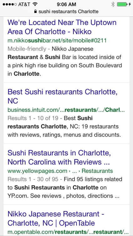
sushi-mobile

How does Google define mobile friendly? According to the article, a page is eligible for the “mobile-friendly” label if it meets the following criteria as detected by Googlebot:

  • Avoids software that is not common on mobile devices, like Flash
  • Uses text that is readable without zooming
  • Sizes content to the screen so users don't have to scroll horizontally or zoom
  • Places links far enough apart so that the correct one can be easily tapped

Okay – so what's the big deal about mobile friendly?

On the surface, this may seem like a relatively minor aesthetic enhancement to Google’s search results pages. However, it’s the reasoning driving this modification that portends even bigger changes ahead. In Google’s own words:

“Have you ever tapped on a Google Search result on your mobile phone, only to find yourself looking at a page where the text was too small, the links were tiny, and you had to scroll sideways to see all the content? This usually happens when the website has not been optimized to be viewed on a mobile phone…We see these labels as a first step in helping mobile users to have a better mobile web experience.”

It’s those last few words – “a first step in helping mobile users to have a better mobile web experience” – that should prompt smart marketers, SEOs and webmasters to sit up and pay attention. While Google has long recommended the use of responsive web design for mobile device support, they are now taking proactive steps to draw attention to those sites that deliver an optimal mobile browsing experience in order to ensure that they are providing the best search results for mobile users.

What this means for you is simple: if your site is not yet optimized for mobile devices, now is the time to change that!

Will “mobile-friendly” sites receive higher ranking on search results pages?

As you can see from the example above, the new “mobile-friendly” label will certainly capture the attention of users searching on mobile devices over results listings that are not given the same designation. In that way, mobile-friendly sites will automatically receive a boost in visibility in mobile search results.

But the question on everyone’s mind is whether having a mobile-friendly site will actually affect where their listing is ranked on the search results page. The answer: quite likely. In the article, Google states that the labels are a “first step” in creating a better mobile web experience, but they also conclude by saying that they “are also experimenting with using the mobile-friendly criteria as a ranking signal.”

It has long been speculated that Google does, in fact, give extra weight to sites that offer quality multi-device support by employing a responsive design framework, but this statement is the first official acknowledgment of this practice. What this means is that in the months ahead, you may see websites that create an experience optimized for smaller-screen, touch-based devices start to climb the rankings over others that do not offer the same. Who knows – maybe Google will even start exclusively displaying mobile-friendly sites for mobile searchers, a move that could really shift the balance in favor of those that provide an optimal experience for mobile users!

If your company is searching for ways to rise above the competition and increase your exposure in search engine rankings, this could truly be a game-changing development – one that should absolutely be capitalized on immediately. Not only will optimizing your site for mobile improve the experience for a growing percentage of your users, but a responsive site is also very likely to be your ticket to improved Google rankings in the future while also earning you their new “mobile-friendly” designation today.

How do I get started?

Google offers a number of tools to help you determine whether or not your site is mobile friendly, starting with their “Mobile-Friendly Test.” Simply plug the URL for any page of your website into this tool, and if it fails the test, Google will offer some suggestions and recommended links to more information about how you can improve your site’s support for mobile users.

You can also use the Mobile Usability Report in Google Webmaster Tools, which highlights major mobile usability issues across your entire site, not just one page.

These tools are a good start, but there is a difference between “mobile friendly” and “mobile optimized.” A site that scales down to better display on small-screen devices and features navigational links that are easily usable on those mobile devices is “friendly”, but there are many other considerations that go into creating a site that provides a truly optimized experience for users on those devices. If your site fails the Google tests, evaluate the suggestions they offer and also be sure to speak to your web design firm about how best to address mobile device support on your site.

The bad news

So optimizing your site for mobile is going be awesome, right? It will improve the user experience for many of your customers, and now that Google is taking a firm stand on this issue, mobile optimization can actually mean greater visibility in search and improved rankings. Those are great reasons to jump aboard the responsive bandwagon, but the bad news is that making a site responsive is no small task.

Responsive web design is not a feature you can simply tack on to an existing site, especially one that is quite old and outdated. Responsive design often requires rethinking how a site’s content is presented, and it almost always involves rebuilding your site from the framework up. This means that to make your site truly mobile ready, you may be looking at a complete redesign.

As 2014 nears its end and 2015 is on the horizon, your company is likely in the midst of budgeting for the coming year, including planning your marketing expenses. Mobile optimization for your website, even if it will require a full site redesign, should be on your agenda because as Google has so clearly stated in their recent announcement, support for mobile devices is no longer just a nice-to-have luxury. Rather, to compete successfully on the Web of today and tomorrow, optimization for mobile devices is an essential element.