Insider Secrets to Killer Website Content: All About Your About Page
June 2013
By Jeremy Girard
As important as good website design is, let’s face it, it’s not what brings visitors to your site. They come for the content, and if that content is sufficiently compelling, then they’ll take the action you desire, whether that’s making a purchase, completing a registration form or even just picking up the phone to contact you for more information. In short, the success of your website begins and ends with quality content.
That’s why in this series of articles – Insider Secrets to Killer Website Content – we’re taking a look at types of content that are common to many websites and exploring ways that they can be redesigned and improved. This second installment addresses a ubiquitous website presence – the “About Us” page.
The ever-present, often-overlooked “About Us” page
You would be hard pressed to find a website that does not have an “About Us” page of some sort. It may be called “Our Company”, “Who We Are” or some other variation on this theme, but in the end, these are all pages focused on telling the visitor about the company to whom the website belongs.
The problem is that these pages are typically as boring as they are commonplace. They generally contain little more than some basic facts about the company – perhaps an abbreviated history of the organization, some details about what the company does or a mission statement.
This information may be necessary – after all, it is your company’s website, so it should contain some high-level, general information about your company. Still, your site – and your “About Us” page – can also contain more than just the facts, ma’am.
A lack of depth
The chief problem with the typical “About Us” page is not that the information it contains is bad in and of itself; it’s that it lacks the depth necessary to play a role in advancing your visitors toward conversion.
Compounding this problem is that “About Us” pages, once written, are rarely ever rewritten. During a redesign process, a website’s content is audited and overhauled, but if the basic facts about the company haven’t changed significantly, the content of the “About Us” page is usually just moved over to the new site with little to no change made at all. As a result, factually accurate but somewhat boring “About Us” content often persists stubbornly through redesign after redesign.
Your company’s history and the services it offers are certainly important information to share, but there’s so much more that truly defines your company, including its unique personality.
Bringing personality into play
Neither the factual history of your company nor your self-proclaimed statement that you “provide outstanding customer service” will set you apart from your competitors, all of whom are saying exactly the same thing, likely in almost exactly the same words. However, what will set you apart is personality.
Every company has a personality. It is the unique product of your people, your company culture and your interactions with your customers. I often find that a company’s personality is energetic and fun when they engage with customers in the offline world, but their online presence captures none of this energy. Instead, the only cards they show are the typical vanilla facts about the company itself. This is what we can change by bringing that offline personality and the particulars of how your company engages in the physical world into the digital space.
Examples of personality
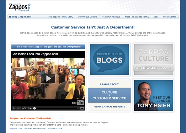
Let’s take a look at a few great examples of websites that are infused through and through with personality all the way down to the “About Us” page, starting with e-tail giant Zappos.com.
Zappos’ “About” page is all about the company’s culture. Yes, the history of the company and their leadership team are there as well, but the main focus of this section is their culture, including images of holiday celebrations and videos of their people. In perusing this content, you get a much better sense of who they are than you would by reading a a mission statement, a brief company history and a bulleted list of achievements and awards.

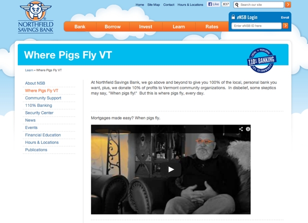
Another example of a website permeated with personality is Northfield Savings Bank. The sense of fun that they’ve built into their brand is an unexpected but delightful surprise, since banking isn’t generally synonymous with fun. Still, Northfield pulls it off on their website. Starting with the logo, which features a flying pig, they carry this theme through their entire site, turning the popular phrase “when pigs fly” into a rallying cry for how they go above and beyond in serving their customers. These stories are told on a subpage of their “About” section as part of their “Pig Stories” video series.

It’s not all fun and games
Personality doesn’t have to be all about fun, holiday costumes or flying pigs. For many brands, fun would be an inappropriate trait – but that doesn’t mean you can’t display a personality.
Perhaps you are a not‐for‐profit organization that provides assistance to those in need in your community. Fun may not fit into your brand, but passion likely will. You can show that passion by using your “About Us” page or section to detail the impact your organization has had, profile the lives it has touched and convey the drive that you have to continue to do more.
Instead of simple facts and figures, personality will provide a well‐rounded, distinctive look at who your company or organization really is. That will be what sets you apart from your online competitors and their typical, boring “About Us” pages.
The more the merrier: Adding team bios
If adding unique personality to your company’s “About Us” page can help differentiate your organization, then adding individual bio pages for your employees can take this to the next level.
Granted, this approach is not a fit for everyone. A massive organization with thousands of employees obviously cannot have a page on their website for every individual. In these cases, the bio pages may be limited to board members or senior-level executives. For smaller organizations, however, it is certainly possible to feature each team member individually, and there is real benefit in doing so.
About a year ago, my company redesigned our website. During this process, we made the decision to include a section for “Our People” and give every employee a bio page of their own. We also decided to allow the unique personalities of those individual employees to shine through on their pages. Rather than using the professional headshots you would find on LinkedIn or in press releases, we encouraged our employees to submit photos of themselves that showed them outside the office environment. We received snaps of our team members atop mountains and glaciers, competing in races of one kind or another, enjoying vacations, feeding animals or just being silly and having fun. Taken as a whole, the photos show the variety of personalities and passions that make up our team.

For the bios, we included a short professional history, but we also asked our staff to share their hobbies, talents and an interesting or unusual story about themselves. Like the photos that accompany these bios, the stories and profiles we created reveal an incredible sense of diversity amongst our team.
What our customers are saying
Adding these individual bio pages on our website was a leap of faith for us. We were unsure how our clients and prospective clients would respond to this type of content. However, I am happy to report that our fears were unfounded, as the response has been overwhelmingly positive.
A number of our existing clients have remarked how they enjoy being able to see a picture of a team member before they are scheduled to speak or meet with that person. They also like to know a little something about them outside of their professional work. In more than one case, a customer and one of our team members have discovered shared hobbies or interests thanks to that team member’s bio page. This common interest has allowed them to engage in discussion and begin to foster a relationship that extends beyond the work they are paying us to do for them.
In terms of prospective clients, the feedback has been positive as well. In fact, we recently closed a deal where the client told us they hired us because of our bio pages. That client was wary about hiring a technology firm, fearing that we would only speak in techno‐babble and industry jargon and be on a different wavelength than their company. Seeing our interests outside the office, they immediately felt reassured that they could relate to us – a feeling they didn’t get when they looked at the websites of our competitors.
That’s a big win for personality if you ask me!
The argument against
The argument that I hear most frequently against adding personality to company or team bios is that it may turn some customers off and drive them away from your business. We worried about this ourselves when we decided to add the individual bio pages to our site.
It is true that a unique personality could drive some potential business away. But the better question is: should you really care? If you present your company’s true personality on your website, and that personality turns someone away, would you really have wanted to do business with them in the first place?
Yes, presenting a personality that is more than a safe buttoned-up suit-and-tie approach may turn some business away, but the reverse also holds true. The personality you reveal may very well be the deciding factor that sets your company apart in a sea of sameness and actually attracts clients that may otherwise have passed you over – exactly as it did in the example I cited above. Had we not put our personality out there, we would not have won that business.
Finding the right fit
No one wants to turn business away, but the reality is that not every potential client will be compatible with the way you operate. Finding the right fit for your company is how you can achieve success in both the short and long term – because even if you do initially win over a company that isn’t truly a good fit for you, they are unlikely to stick around for long.
Finding the right fit allows you to build a relationship that may start with one job but grows stronger and deeper over time to create long‐term engagements and partnerships that can help drive success long after that first project becomes a distant memory. One of the ways to find this right fit is to always remain true to who your company is and not be afraid to let your personality shine through for all the world to see.
You’re not done yet
Finding ways to take “About Us” content from the typical company facts and figures to something that will differentiate your company is just one example of how rethinking content can make your website a more powerful conversion engine. Subsequent entries in this series will explore other common elements of website content that can be improved to bring more value to your visitors and greater returns for your business.
Jeremy Girard has been designing for the web since 1999. He is currently employed at the Providence, Rhode Island-based firm Envision Technology Advisors and also teaches website design and front-end development at the University of Rhode Island. In addition, Jeremy contributes regularly to a number of websites and magazines focused on business and the Web, including his personal site at Pumpkin-King.com.