Tweet, Snap, Share, Post, Pin: Five Creative Ways to Get Your Customers to Do Your Marketing For You

Today’s digital age is also the post-advertising era. Armed with access to nearly limitless data and information, customers have grown disengaged from commercial culture as we once knew it and disillusioned with canned corporate marketing messages.
This is especially true of the latest generation of consumers – the Millennials (aka Generation Y). Encompassing roughly 72 million young Americans, the oldest of whom are now reaching their mid-30s, the Millennials represents the most educated, diverse, technologically proficient generation ever in the U.S., with tremendous spending power that is expected to eclipse that of the Baby Boomers within the next three years.
Another hallmark of the Gen Yers is that they have a strong aversion to "push" marketing and prefer brands that are engaging and already embraced by their friends. According to Christine Hassler, author of 20 Something Manifesto, “Friends are the biggest influencers for Gen Y. If their friends have something and endorse it, that's all they need.”
All of this evidence points to an inescapable fact of doing business in today’s culture of the Web: nothing holds greater sway than word of mouth. If you want to grow – and especially if you want to capture the up-and-coming Millennial dollar – you need the help of your customers and fans.
However, these customers and fans aren’t simply sitting around, waiting at the edge of their seat for the opportunity to promote your products and services. It’s up to you to get the ball rolling by structuring campaigns that reach your customers where they live (i.e., social media platforms) and give them opportunities to share that tap into their motivations and fit naturally with their habits and lifestyle.
Here are five creative ways you can leverage social media to connect with your customers and get them to do your marketing for you:
1. Solicit their stories.
Sometimes spurring your evangelists to spring to action is as simple as asking them to. After all, who doesn’t love sharing stories about themselves?
Everyone can agree that medical supplies is hardly a highly glamorous field. However, Medtronic Diabetes, which develops and sells diabetes management products, has achieved a 2-to-1 return on investment for their entire social media program based on the success of their Share Your Story Facebook app.

Since launching the app in June 2013, nearly 300 customers have shared stories and photos using the app, and over 80% of users have opted to allow their photos and stories to be used by Medtronic Diabetes in other ways. To maximize the mileage they get from this great user-generated content, Medtronic is also proactive about contacting those who have shared their story to participate in photo shoots, video testimonials and guest blogging.
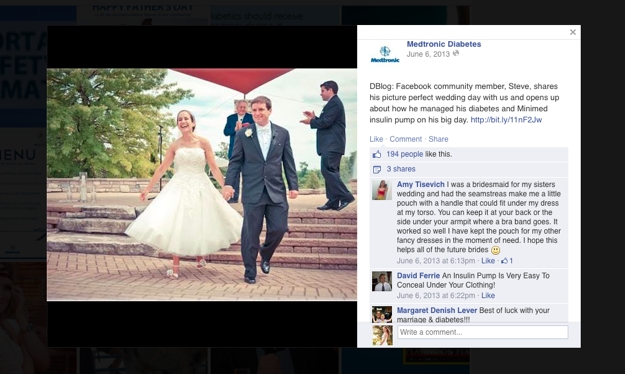
When Steve, a Facebook community member, posted a photo from his 2012 wedding using the app, Medtronic followed up with a request to guest post on their blog, “The Loop,” which the company started as a forum to foster discussion about living with diabetes. Steve happily complied, penning the article “Getting Hitched With Diabetes: The Groom’s Perspective,” which they reposted on their Facebook page.

Key to Medtronic’s success is that they are very specific in the framing of their request. When the company first launched its app, the prompt asked users to share “moments in your life of living well with your insulin pump or continuous glucose monitor,” but they found that the majority of participants would write only one or two lines. In March 2014, they retooled the wording to say, “Share with us your personal story about the pivotal moment you switched to the pump and CGM, and how insulin therapy has helped you focus on the wonders of life,” and they discovered that this more specific request elicited much more rich and detailed tales from their customers.
While you might wonder why Medtronic’s customers are so eager to share their stories, Amanda Sheldon, director of digital marketing and communications, explains: “We know our customers and know that they like to support each other. Our hope that social media would bring this all together was definitely met.”
2. Share the spotlight.
As the relentless onslaught of the selfie has shown us, social media is the ultimate “Look at me!” medium. Tap into your customers’ love of all things me-centric by creating a campaign founded in giving them the opportunity to shine a spotlight on themselves – and on your products in the process.
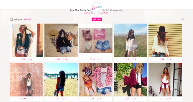
Clothing brand Free People has come up with an ingenious way to integrate customers' Instagram shots with its website. The company has begun attaching individualized hashtag information cards to its jeans. Customers are encouraged to take pictures of themselves in the pants, tag them either with #myfpdenim or more specific tags for different jean styles (such as #fpanklecrop for the 5 Pocket Ankle Crop or #fpsorbettiedye for Sorbet Tie Dye Jeans). These photos not only appear on Instagram but also on the relevant product’s page on the company's website (after being approved by site moderators, of course) in a special section called "Free People's Style Community."

This brilliant campaign succeeds on two levels. First, by designing a platform that turns their customers into models, Free People has created the ultimate indulgence for the selfie-aholic. Second, they overcome an obstacle that has plagued e-tailers since the concept was invented, which is giving shoppers the confidence to make a purchase without being able to see, feel and try on the product in person. But now, through the magic of Instagram and social sharing, Free People empowers potential buyers to see how a pair of jeans looks in real life. Win-win!
3. Give to get.
Sometimes, you need to be willing to give a little bit in return for the great promotional juice your customers are providing to you. Often brands use contests as a way to motivate fans to snap, share or post in exchange for the chance to win a prize.
However, prizes certainly aren’t the only way to incentivize your followers. An even better way is to share your time and expertise. For example, Zappos – a company that has built its reputation on providing exceptional customer service – has created a forward-thinking Instagram campaign that is the perfect marriage of its trademark service and customer engagement.
Capitalizing on the popular #OOTD (“outfit of the day”) hashtag – which has more than 23 million images attached to it – the online retailer has launched a pilot program for a personalized shopping service called NextOOTD. When a customer posts a selfie with the hashtag #nextOOTD, a Zappos stylist will comb through their Instagram history and respond with personalized shopping recommendations catered to their unique style.

This campaign is social media engagement at its very best. First, it’s easy for customers to participate in. By building on the already familiar #ootd hashtag, it’s a natural extension of a well established habit for Instagrammers. Second, it’s personalized: this concept of selfie shopping allows Zappos to interact with people like a human, not a brand, which is exactly what every company should aspire to do on social media. Finally – in perfect keeping with Zappos’ mission of delivering happiness – it’s a great way to surprise and delight their customers, especially the type of selfie-wielding fashionistas who are most apt to use the #ootd hashtag in the first place.
4. Bank on bloggers (and other influencers).
Here’s an interesting fact for you: Research has shown that one-fifth of the consumer population is composed of key influencers who impact the purchasing activities of 74 percent of the population.
Chief among these influencers are the legions of bloggers and vloggers who have masses of dedicated followers hanging on their every word. If you can put these prominent opinion-pushers in your corner, you can turn the power of word-of-mouth marketing up to 11.
Blue Apron is a new start-up subscription service that delivers meal kits – including pre-measured ingredients and recipe cards – in refrigerated boxes on a weekly basis to its members.
According to Ken Fox, one of the company’s investors, Blue Apron’s target market is comprised of “People who like to cook at home but don’t always have time for shopping,” and their hope is that these people “discover the ease of cooking with Blue Apron [then they] start to do it more often, and to get their friends and family members into it, too.”
And who could fit that profile better than mommy bloggers – specifically Katie Bower of the hugely popular blog Bower Power? Katie has nearly 15,000 followers on Facebook and more than 25,000 on Instagram, so needless to say, there is no lack of moms (and other busy women) who identify with her and look to her for great ideas and advice. And as it so happens, Katie also recently gave birth to her third son, so she has no lack of demands on her time.
For the price of a sponsored post, Blue Apron reached all of her followers in the form of a glowing review written with Katie’s trademark candor – along with a series of fun images depicting the process of receiving the box, unpacking its contents with her adorable boys, preparing the meals and enjoying the dinners together as a family.


The end result is a testimonial that is 100 percent authentic – and 100 percent more effective than anything the company could have said about itself in a perfectly polished ad campaign.
5. Create a marriage of mediums.
All of this talk of social media posting, hashtagging and sharing begs the question: how can you take advantage of your fans’ promotional activities to reach a broader audience that includes those who don’t follow you on these networks?
The answer: integrate your social media campaigns into your traditional marketing efforts. Case in point: Ben & Jerry’s wildly successful #CaptureEuphoria contest.
In 2012, Ben & Jerry’s tapped into its Instagram community (which at the time numbered 120,000+ strong) to cast the starts of its latest ad campaign. The company invited fans to post photos tagged #captureeuphoria that they felt depicted intense feelings of joy. From sunsets to wedding photos to cute dogs to beach scenes, these user-submitted snaps were collected into a special gallery on the company’s website.

One interesting thing you’ll notice about the contest: there was no requirement to feature the company’s products in the photos. Rather the idea was to associate the emotion of euphoria with the experience of eating Ben & Jerry’s ice cream – very clever indeed.
At the conclusion of the contest, more than 25 shots were selected and featured in hyper-local media in the winners’ hometowns in ads that popped up in locales ranging from billboards to buses to neighborhood bars.
For more than a decade, Carey Arvin has worked hand-in-hand with premier brands, helping them define their voice through marketing mediums, the Web and the social sphere in ways that engage customers and inspire trust. Carey currently serves as the editor in chief of Fame Foundry Magazine and The Fame Foundry Marketing Minute.