Get it Type: Six Fundamentals of Good Typography in Website Design
November 2013
By Jeremy Girard
Typography is often one of the least appreciated – yet most important – aspects of website design.
So much more than just the “font” that is used to present your site’s content, the choice of typeface does as much to set the tone of the site as the colors, images and other visual components of the design. If the content on your website is your brand’s message, then the typography is the voice with which your site speaks that message.
The study of typography has a long and rich history. While designers work for years to perfect this practice, by cultivating an understanding of a few basic principles, you can more effectively communicate with your design team as you work collaboratively to make the right typography choice for your website and, through those choices, find the perfect voice for your site.
Here are six fundamentals of good typographic design that will help you avoid potential pitfalls and make sound aesthetic choices that will strike the right tone and support the delivery of your message:
1. Know what’s possible.
If you’ve been involved in a website design project in the past, then you’ve likely heard the phrase “web-safe fonts.” For years, limitations in web browsers forced us to utilize a very small group of fonts for our websites. If you requested the use of a font that fell outside of this select group, you would have been directed, instead, to one of these web-safe fonts so that the site’s text could be reliably displayed across a wide variety of browsers.
In the past few years, however, this restriction has been greatly minimized as a new feature called @font-face (pronounced “at font face”) has been introduced, allowing us to make use of thousands of new fonts on our websites in a reliable way. This is both a blessing and a curse.
The blessing lies in the ability to use the wide array of wonderful typefaces available to us today to create incredibly rich and unique designs. The curse is that, with so many options, it’s all too easy to overdo it and create a muddled mess with competing typefaces that obfuscate the message you are trying to send.
Also, despite all of the advancements made in web fonts in the past few years, there are still limitations to what we can and cannot do with fonts on websites, so ask your web design team about these limitations to ensure you make choices that will work on a technical level.
2. Make strategic use of different font classifications.
Different font classifications have different feels and serve different purposes, so developing an understanding of these classifications is a good place to start.
Serif
A serif is “any of the short lines stemming from, and at an angle to, the upper and lower ends of the strokes of a letter.” If you look at a font like Times New Roman, you will notice the little flourishes that hang off the ends of each letter, adding an extra embellishment to those letterforms.
Besides Times New Roman, other popular serif fonts include Georgia, Baskerville, Garamond and Palatino. Serif fonts are often used when you want to convey a sense of history or tradition in a design. Historically, serif fonts were used in the body text of printed works because they made large blocks of text easy to read. For computer screens, serif fonts are very versatile and can be used effectively for either body text or headlines.
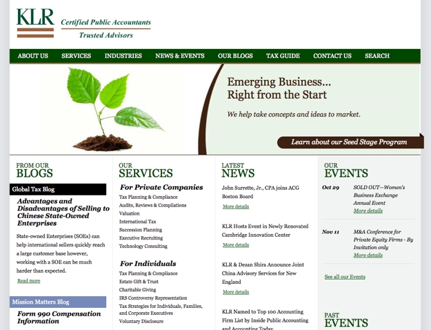
The accounting and business consulting firm
KLR uses the serif font Georgia throughout their site to create a look that conveys a sense of professionalism, trustworthiness and experience.
Sans-serif
Sans-serif, or “without serif,” fonts feature letterforms that do not have the extra embellishments found on serif fonts. Common sans-serif fonts include Arial, Helvetica, Verdana, Futura and Tahoma.
In printed text, sans-serif fonts were typically used only as headlines because it was easier to read body text set as a serif font rather than a sans-serif, but for computer screens and websites, sans-serif fonts are equally as readable and versatile as serif fonts, so they can be used either for headlines or body text. The straight lines of sans-serif fonts and the lack of extra ornamentation often make these typefaces good choices to create a sleek, modern look.
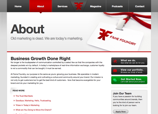
An example of sans-serif fonts can be found here on
Fame Foundry in our navigation, our main billboard message and throughout our site in both headlines and body text.
Slab-serif
Similar to serif fonts in that they have extra embellishments added to them, slab-serif fonts often feature thicker, chunky letters whose serifs are blocky with little, if any, contrast between thin and thick lines. Typical slab-serif fonts include Rockwell and Clarendon. The bold letterforms and serifs of this font classification often give them a strong, impressive weight when used as headlines. These fonts are typically not used as body text but are often set in large sizes as headlines.
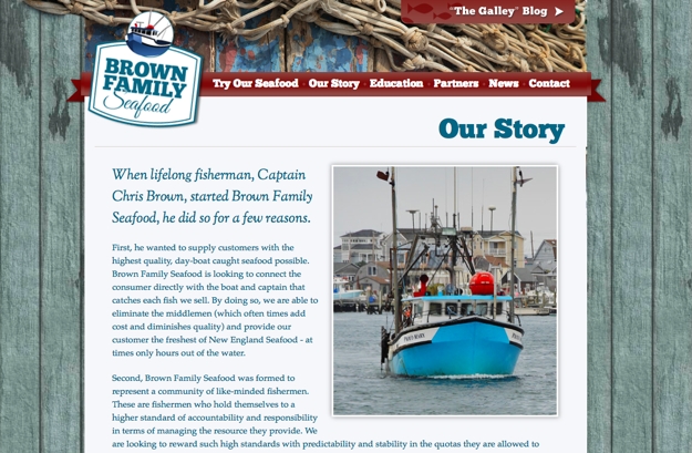
An example of slab-serif fonts can be seen in the logo, navigation and main headlines of
Brown Family Seafood’s website, which uses a typeface called ChunkFive.
Display
Display fonts are typefaces that are typically only used at large sizes and are therefore better suited to headlines and large messages than body text. Display fonts typically have lots of character to them and are richly designed.
With a wide variety of looks and styles available in display fonts, these fonts can be an excellent choice for headlines since they will add that character to the design, but these fonts are also easy to abuse or overuse. Typically, more than one display font in a design is too much.
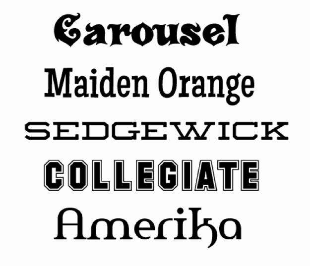
A few examples of display fonts are shown below:
Grunge
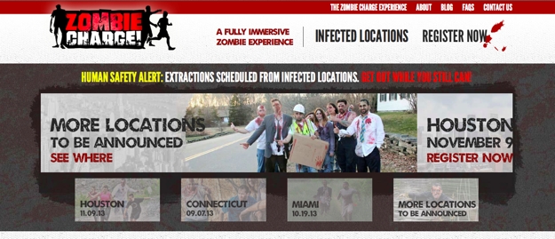
Grunge fonts are typefaces that are designed to show artificial wear, almost like the printing on a vintage t-shirt that has been through the wash many, many times. These fonts, which are also typically used only in headlines or for large, short bursts of text, are a great choice when you are trying to add a worn, textured feel to your design.
The city locations listed in the billboard text on
Zombie Charge, which tries to recreate a worn and battered look for their zombie-themed adventure runs, uses a grunge font called Umbrage.
Script
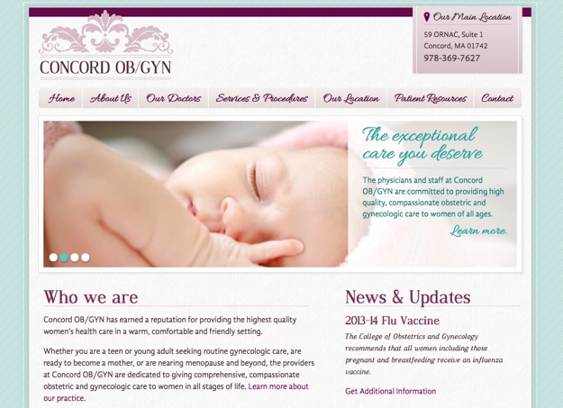
Script fonts have a classy, elegant feel to them. These fonts typically have long, flowing characters and very thin letterforms. Because of this, script fonts are often only used for headlines and at larger sizes, because if you set these fonts too small, the thin letters become unreadable. Script fonts are a great choice when you are looking for a high-end, elegant feel and tone.
You can see a script font, Allura, used in a number of places in the design for
Concord OB/GYN, including in their navigation and main billboard messaging.
Hand-drawn
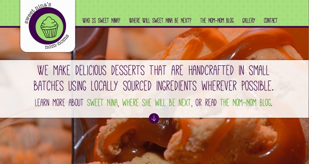
Fonts that are classified as “hand-drawn” have an organic, if perhaps flawed, look to them. If a script font is drawn by a master artist, then a hand-drawn font is scratched out by an everyday writer who may be in a bit of a rush. These fonts can be used to add a human touch to a design and make it feel like an actual person, and not a digital computer, wrote out the words.
The font Mathlete that is used on the billboard message for
Sweet Nina’s Nom-Noms has an organic, hand-drawn feel to it that reflects the handcrafted desserts that the company offers.
Novelty
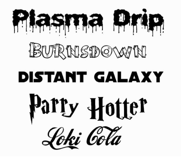
Novelty fonts are often made to replicate popular brands and their distinct characteristic look (think Coca-Cola or Harry Potter). Because of their inextricable association with a well-known brand, these fonts are rarely appropriate to use on a website for another company.
Other novelty fonts simulate things like dripping liquid, wood pieces or bones to create the letterforms. While these display fonts are not immediately associated with another brand or company, their overly stylized design also makes them a poor choice for most applications – although if you are going for this type of overly stylized look (for a Halloween-themed billboard message, perhaps), then they can be considered.
A few examples of novelty fonts are show below:
3. Always preserve readability.
As you undoubtedly noticed in perusing the above overview of font classifications, most of these fonts are meant to be set at large sizes as headlines. Only serif and sans-serif fonts are versatile enough to be used effectively for both headlines and body text. This is because of readability.
If the font you use for your website is your site’s voice, you not only want to be sure the voice is appropriate for your brand but also that the voice speaks clearly. In this case, “speaking clearly” means having text that is easy to read.
The overly stylized letterforms of grunge or display fonts and the thin letters of script or hand-drawn typefaces make them difficult, if not impossible, to read when set at smaller sizes. Since body text is set at smaller sizes, using these fonts would be an inappropriate choice.
Regardless of which font you use, be sure to view it at the size that it will be set at for the actual website and in the colors that will be used. This will allow you to see the contrast that font has when set against its background so you can determine if the choice you have made provides an easy reading experience for your audience.
4. Avoid overused fonts.
Certain fonts carry a stigma with them due to how they may have been used, or overused, in the past. Fonts like Papyrus have been used in so many – often poorly applied – ways that they immediately have a negative association attached to them. In the case of Papyrus, there is even a website called
Papyrus Watch that will show you many examples of how this font has been used and abused.
Other fonts become overused in a relatively short time. The typeface Gotham was used by the Obama campaign in 2008, and it quickly started showing up everywhere as other designers jumped onto the bandwagon of this suddenly popular font. As a result, Gotham quickly hit the saturation point and now feels cliched.
Some fonts may not be overused in general but only in your niche or market. If your competitors all use the same type choices, there is an easily forgettable, vanilla quality to that approach. By choosing a different typeface, you can set yourself and your site apart from your competition right from the start.
5. Practice restraint.
The wealth of fonts available to use today makes it very easy to overdo it, but by practicing restraint and limiting your site to maybe two or three different font choices at most, we can work to avoid overuse.
As Robert Bringhurst says in his definitive volume, The Elements of Typographic Style, “Don’t use a font you don’t need.”
By limiting your site’s design to only a couple of choices, you’ll create a clean, clear visual rhythm and ensure that the variety of type styles do not create a confusing mess.
6. Choose complementary fonts.
One way to limit your font choices is to select a pair of fonts that contrast and complement each other, perhaps with one choice for headlines and another for body text. This contrast, and the restraint demonstrated by your choices, will help create a professional and readable presentation.
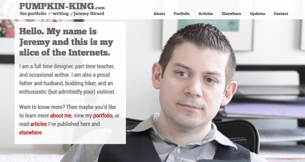
A look at my own
personal website shows this contrast. The site uses two fonts, the thick slab-serif ChunkFive for the navigation, main billboard message and logo, and a contrasting sans-serif font, Roboto, for the body text. The thick, chunky letterforms of the slab-serif work well alongside the thin, clean letters of the serif, creating a presentation that is easy to read with font choices that do not overpower the messages I am trying to send.
In summary
With a basic understanding of typographic best practices, you can better communicate with your design team to select font choices that work best for your organization. Some basics to remember include:
- Despite the advancements made in web fonts in the past few years, there are still limitations to what we can and cannot do with fonts on our websites. Ask your web team about these limitations to ensure you make choice that will work on a technical level.
- Understand the different font classifications and make choices that reflect the personality of your brand.
- Always remember that readability is key and choose fonts set at a size and color contrast that make them easy to read on the screen.
- Avoid overused fonts or fonts that carry a negative association with them from the very start.
- Don’t overdo it. A few judicious selections should be all you need.
- Look for fonts that pair well together. Using one font for headlines and another for body copy is one way you can the number of fonts while still maintaining nice variety and contrast.
Jeremy Girard has been designing for the web since 1999. He is currently employed at the Providence, Rhode Island-based firm Envision Technology Advisors and also teaches website design and front-end development at the University of Rhode Island. In addition, Jeremy contributes regularly to a number of websites and magazines focused on business and the Web, including his personal site at Pumpkin-King.com.