Small Changes, Big Impact: 5 Things You Can (and Should!) Do Today to Boost Your Website’s Performance
June 2016
By Jeremy Girard
Every spring it happens like clockwork: the temperatures get warmer, the days get longer and everything in nature becomes more vibrant and colorful. Along with these changes in the great outdoors comes the irresistible urge to clean house and embrace a fresh start.
Why not keep that motivational momentum going and apply it to your business – and, more specifically, to your website – as well? After all, there’s no time like the present to sweep away the old and outdated and bring in fresh new ideas and technologies.
But you don’t necessarily need to dive head-first into a full redesign and all of the time and expense that entails to reap measurable results. Instead, here are five small steps you can – and should! – take today to ensure that your site is up-to-date, relevant and doing all it can to bring you new customers and grow the community around your brand:
1. Reposition your contact form.
For most website owners – especially those in service-based businesses such as law, accounting, consulting, real estate, etc. – the key “win” for their site is when it motivates a visitor to request more information or schedule a meeting.
Contact forms are a ubiquitous website staple intended to provide a convenient – and highly measurable – avenue to initiate communication between an interested prospect and a company. However, perhaps because they are so commonplace, all too often these forms are given little strategic thought, resulting in a cookie-cutter name/email address/phone number format that yields more bogus spam submissions than legitimate new business opportunities.
However, there is one simple change you can make that has been shown to get better results: reposition your standard “Contact us” form as an “Ask our experts” feature. By doing so, you shift the focus of the form to providing your visitors with an opportunity to submit a question that is specific to their needs and concerns. Rather than feeling like they are opening themselves up to an endless barrage of solicitation calls and emails, your visitors will sense that they are initiating a dialogue with an expert who will help them solve their particular problem. Make sure to respond to all inquiries within 24 hours, provide helpful advice that is free of charge and tailored to your prospect’s situation, and leave the door open to continue the conversation in a future meeting or phone call. By doing so, you will establish an important foundation of trust and confidence with your potential new client that will make them more inclined to engage your professional services.
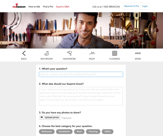
I have personally seen the submission rates on these types of forms increase dramatically. On one site where this small change was implemented, form submissions jumped from one or two per week to one or two per day – all legitimate business opportunities that were sparked simply by repositioning the focus of the form.
2. Productize your offering.
Another challenge that professional services organizations face in creating a website that works as an effective customer conversion engine is that they do not sell a specific product but rather a suite of services that can be customized to each client’s specific needs. This makes it terribly hard to market to visitors who come to their site and simply want to know “What exactly does this company sell, and how much does it cost?”. Because there are so many variables to the company’s offerings, there is not a quick and easy answer to these questions.
If this challenge sounds familiar to you, one approach you can try is to “productize” what you have to offer. Create a bundle of services with a fixed price, and market that package on your site in a simple, straightforward manner that makes your offering easy to understand and helps visitors feel like doing business with your company is as simple as buying a product off the shelf at a store.

This is exactly what my company did with some of the technology consulting services that we offer. Instead of only listing the array of services we provide, we also created a product that representing a very specific offering. This made it so much easier to answer the “What do you sell?” question, and it gave us something tangible to promote in our marketing campaigns. In reality, this approach in no way limited the range of services we are able to offer our clients; rather, it merely served as a vehicle to open doors to new opportunities and made it easier to start conversations with new customers for whom we could ultimately provide a custom-tailored solution.
Examine the services that you offer, and work with your marketing team to create an appealing package that you can market – understanding all the while that this “product” is really just a means for you to connect with customers and begin the sales process with something tangible that they can easily understand.
3. Lose your home page carousel.
One simple change that I have seen many websites make in the past year or so is to remove animated image carousels from their home pages. These carousels have long been a popular fixture of website design, but the reality is that they can sometimes do more harm than good.
Home page carousels typically feature giant, screen-spanning images which carry with them heavy download requirements both for the images and for the scripts that power the animation sequences, thereby creating a potential stumbling block in performance for users on mobile devices or with slower connections. Additionally, studies have shown that click-through rates on animated carousels are extremely low, and they drop significantly from the first slide to the subsequent ones.
This is why many companies are replacing rotating carousels with a singular static message instead. This one change can greatly reduce a page’s download size (when my company did this on our home page, its file size decreased by 75 percent) while having little to no effect on actual user engagement or click-through. In fact, because the page now loads more quickly, many sites actually see an uptick in user engagement because fewer people are abandoning a site due to poor performance.
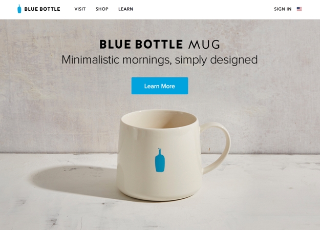
Do you have a carousel on your website? If so, do you know whether or not it is working well for you? Your marketing team may be able to do some A/B testing between a version of your site with this animation feature and one without it to see which performs better. Since carousels do work well for some sites (like news organizations or sites with lots of frequently updated content), having this data can help you determine whether or not it’s time to ditch the carousel.
4. Update your image(s).
Stock photography is something of a necessary evil of website design, as more often than not, companies don’t have the budget to execute a full-fledged custom professional photo shoot. However, not all stock images are created equal. Stock photos that are overused or that look so obviously staged that they scream of their “stockiness” can cheapen a site’s design and leave visitors with a negative overall impression of the site. Replacing those images can make a big difference in a site’s visual appeal.
If your site’s imagery is stale, you can make some simple image swaps to freshen it up. If you are going to change out old stock images for new stock images, make sure to seek out photos that feel fresh and that are not terribly overused (most stock photo sites will tell you how many times an image has been downloaded).
An even better option is to try to add some unique imagery to your site. This could be photographs that you hire a professional to take or – in keeping with one of this year’s hottest trends – custom illustrations that you commission from an artist.
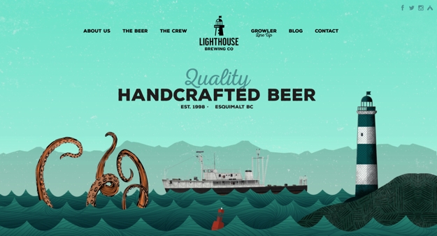
If your budget is tight, incorporating even just one or two such one-of-a-kind images in key spots on your site can really boost its visual impact. For instance, if you lose that aforementioned carousel on the home page and replace it with one truly compelling static image and message, it can make a really powerful first impression on your visitors.
5. Publish less.
Most experts agree that publishing original, value-add content on your site on a regular basis is key to optimizing its success – both from a sales and marketing standpoint and as an advantage in the never-ending battle of SEO. While I agree with this approach in principal, for many companies, the drive to publish regularly has resulted in putting out mediocre content simply to meet an inflexible standard of frequency. This is often an entirely counterproductive effort, as content that lacks in quality, original thought or value for the reader reflects poorly on the organization and its perceived level of expertise.
Publishing original content to your site on a regular basis is still a best practice, but that content must offer value for it to succeed. Let’s say a visitor comes to your site and is impressed to find that you publish new articles weekly or monthly; however, once they click through the headline to see what they can glean from your writing, if what they find is mediocre at best, what motivation do they have to return to your site again in the future, let alone entrust you with their hard-earned dollars?
If, on the other hand, you publish new content less frequently, but everything you produce is of the highest quality, then that same visitor will know that the time they spend on your site will always be worth their while, and they will look forward to the next time you post something new.
Re-examine your current content marketing strategy, and ask yourself whether you are focused on quality or frequency. If it’s the latter, commit instead to writing less but to improving the quality of what you offer on your site. While this change may not have an immediate impact, it will absolutely yield long-term results that your visitors will appreciate and respond positively to.
In closing
Eventually, your website will need a redesign, but in the meantime you can make small, strategic, surgical changes that will pay immediate dividends in your site’s success.
This approach of implementing gradual but regular modifications will also benefit you when it does come time for that full redesign. By making intelligent improvements over time, you will ultimately be closer to your end goal, leaving less to accomplish with the redesign and thereby paving the way for a smoother and less costly project.
Jeremy Girard has been designing for the web since 1999. He is currently employed at the Providence, Rhode Island-based firm Envision Technology Advisors and also teaches website design and front-end development at the University of Rhode Island. In addition, Jeremy contributes regularly to a number of websites and magazines focused on business and the Web, including his personal site at Pumpkin-King.com.