20 Questions to Determine If It’s Time to Redesign Your Website, Part 1
July 2011
By The Architect

Your website should be your number one salesman 24 hours a day, seven days a week. If that’s not the case, then you need to find out why it’s not performing as it should.
If your answer is “no” to any of these questions, a redesign might be just the right prescription to boost your site’s ability to attract new leads and cure what’s ailing your conversion rate.
1. Is the design beautiful?
Once upon a time, it was enough to simply have a website as the online outpost for your business – a virtual Yellow Pages ad of sorts. In today’s culture of the Web, that’s no longer the case.
Just as design principles, interface conventions and programming languages have evolved, user expectations have become more sophisticated right along with them. Potential customers make no differentiation between the quality of your website and the quality of your brand. If your site is ugly and outdated, your brand will be headed for extinction right along with it.
2. Is the content beautiful?
The text on your website is just as much a part of its design as other ostensibly visual elements such as the color palette, typography, images and layout.
If this seems like an oxymoron, it’s not. In fact, design is the packaging for the delivery your content. If a visitor to your site lands on a page and sees nothing but a disorganized sea of text, they’ll be immediately overwhelmed, and they won’t even begin to try to make sense of it.
Good design applies content to the canvas of your site with the finesse of an artist. By augmenting your text with beautiful photography, illustrations, diagrams, infographics and pull-quotes, you’ll create a more pleasing user experience every time.
3. Does it reflect the personality of your brand?
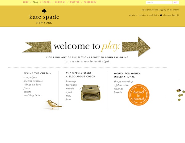
In the age of social media, the walls that once existed between companies and their customers have been torn down. People want to do business with people, even when the actual exchange occurs between computer screens.
It’s easy to let your corporate guard down on Facebook and Twitter. But what happens when your fans and followers land on your site and find it completely devoid of personality? The discrepancy will be off-putting. It will make your social media engagements feel phony and make the user experience on your website feel cold and empty.
There are any number of ways to infuse personality into your website – blog articles, powerful images, video content, interaction with customers through reviews and comments...the list goes on and on. Make sure that your website has a pulse.
4. Is it built for your target audience?
A site that tries to serve the needs of every imaginable user will effectively serve the needs of none of them.
Think about your typical sales prospect. How sophisticated are they? Where are they in their decision-making process? What are their questions and concerns?

Do they know what they need buy not who they want to buy it from? If so, the most important objective your site needs to accomplish is establishing credibility and trust.
Do they not know what they need? Or are you bringing something new to the market? Then your website must first lay a foundation of education while also building trust.
5. Is it user-driven?
Does your site serve you or your visitors?
Before you answer, realize that’s a more complex question than it seems on the surface.
A site that serves you goes straight for the kill with its sales pitch. It’s all about you, you, you, and how absolutely, indisputably awesome you are.
A site that serves your visitors is built around utility.
It speaks their language.
It answers the questions and concerns that are on their minds.
It helps them make decisions they feel confident in.
It makes their lives easier or more fun.
It gives them reasons to come back again and again.
It offers them opportunities to interact with your brand and with other customers like them.
It creates a place where the members of your
tribe want to be.
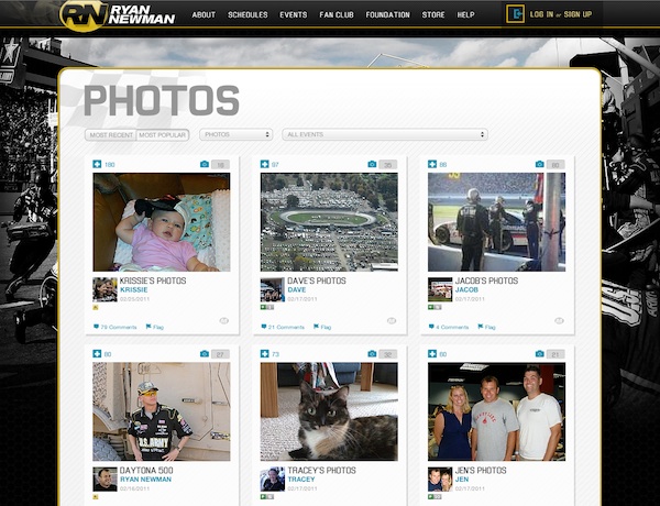
And, yes, it does sell. But it does so based on a foundation of trust and relationship-building.
6. Is the content-to-framework ratio in check?
Many websites devote far too much real estate to the framework, letting supersized logos and tag lines, multiple tiers of navigation, log-in and search fields, mammoth masthead images and trendy social media widgets become the dominant visual elements of the site.
Remember that the framework of your website represents nothing more than a set of branding and navigational tools that literally frame the canvas on which your content lives. And just as a frame shouldn’t steal focus from a painting, the framework of your site shouldn’t steal the spotlight from the content you depend on to achieve conversions.
Instead, it should remain as streamlined and unobtrusive as possible. If your visitors spend enough time on your site, they should all but forget it’s even there.
If more than 20 percent of the screen is devoted to the framework, the only cure is to apply good principals of architecture and organization to rebalance the design.
7. Is there engaging content front and center throughout?
In today’s Web marketing universe,
content is the catalyst of organic business growth. High quality, unique content that is updated regularly elevates you perceived authority with search engines, which improves your ranking in searches pertaining to your core offering, which brings more qualified visitors to your site. And when those prospects land on your site, your content builds trust, vets your expertise and motivates buying decisions.

But remember, content is not just your brochure copy, nor is it just your blog. It’s your product descriptions, videos, images, customer reviews and reader comments. All of these elements must work in conjunction to allow your customers to connect with your company and your brand on a more intimate level.
8. Is it a slave to the fold?
For years, everyone obsessed over making sure every ounce of important content was squeezed into the limited real estate that falls above the mythical “fold.”
Unfortunately, this is nothing more than a wide-spread fallacy of good website design and architecture.
Think about it: which would you rather do – dig through page after page of content or simply scroll down?
That’s right. Scrolling down the page is a perfectly acceptable method of scanning and seeking through content. This is all the more true now that touch-based interfaces have gone mainstream and scrolling involves the mere swipe of a finger.
By contrast, pagination introduces a wait state which requires visitors to reset their viewpoint and mentally realign with your interface. This is a jarring and disruptive experience, and with every click-and-reset, you run the risk of losing their patience or attention.
Simply put, give your content room to breathe and let your pages scroll.
9. Are your customers’ voices being represented?
We’ve said it before, and we’ll say it again: in today’s consumer-driven marketplace, nothing holds greater sway than
word-of-mouth.
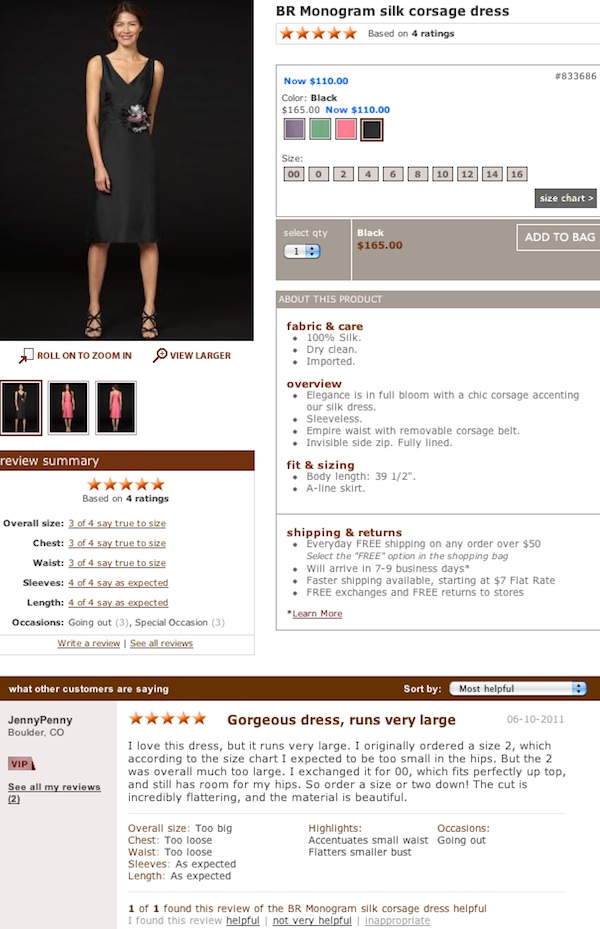
If you want to build instant trust and credibility through your website, find ways to let your customers do the talking for you, whether it’s through testimonials, case studies, ratings or
reviews.
10. Does it stack up to the competition?
As we’ve established previously, you shouldn’t
fall into the trap of including unnecessary bells and whistles on your site simply because your competitors do. Your site should be designed to serve your business growth objectives and no one else’s.
But make no mistake: today’s consumer will shop around. You’ll will be compared to the competition. However, it’s important to scrutinize the fundamental elements of the user experience your competitors’ sites provide. If they’ve set the bar, you must raise it higher.
Did you pass?
If you’ve answered “no” to several of these questions, do not pass go, do not collect $200. You can’t afford to let another day go by with a website that’s not only underperforming but actually sending customers to your competitors.
If you’re 10 for 10 in the “yes” column, don’t breathe a sigh of relief just yet. You’ve only passed the first half of the test.
Next, we’ll take a closer look to uncover the insidious, silent killers that are harder to detect but equally deadly to your site’s performance.
Behind every superstar website there is an architect, scrutinizing every single detail, cutting through the nonsense, and challenging every aspect to craft a masterpiece that gets noticed and gets results.